New construction and renovation of a fashion house — Marktplatz 28, 94065 Waldkirchen, Germany — 9,000 m² 09/ 2013 — Garhammer GmbH, Waldkirchen
Extensive trade-up
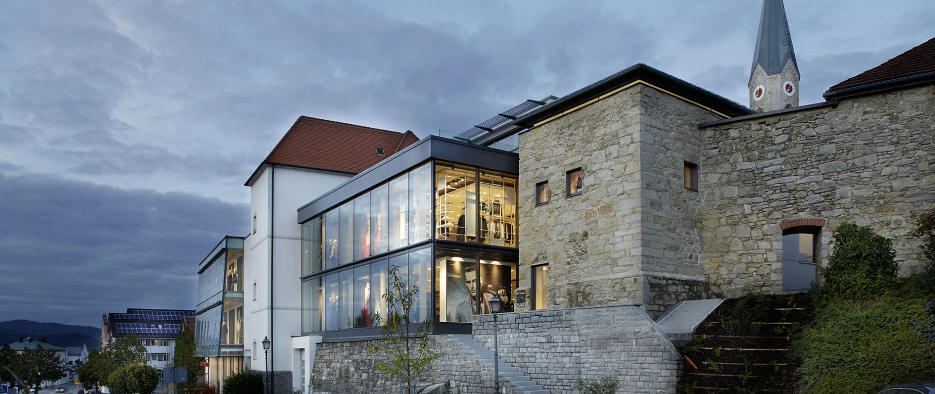
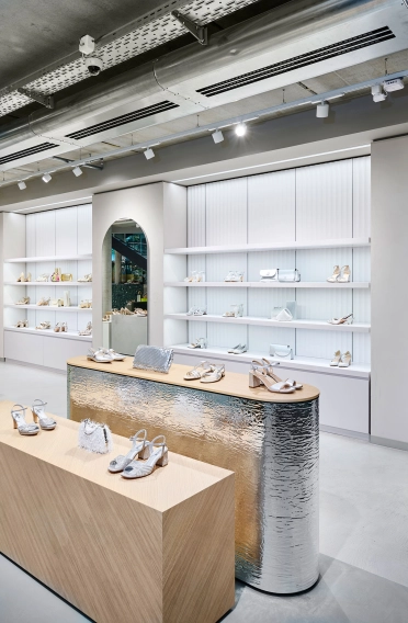
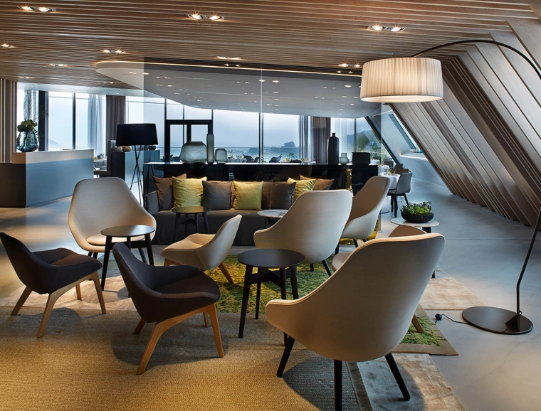
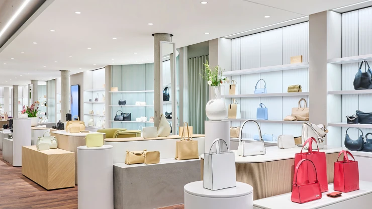
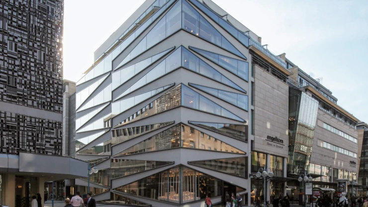
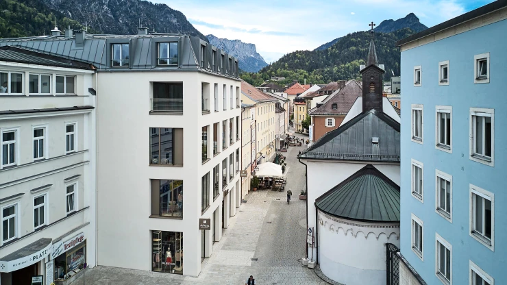
With the most extensive renovation in the history of Garhammer, blocher partners have carefully expanded the complex commercial property. Due to the steep topography of Waldkirchen's downtown area, the arrangement of space follows the site's natural features. In keeping with the principle of split-level construction, several floors are set off from one another, with each level having its own identity. Since 1997, blocher partners has been collaborating with Garhammer. Its accomplishments include the new construction and renovation of a gourmet restaurant.
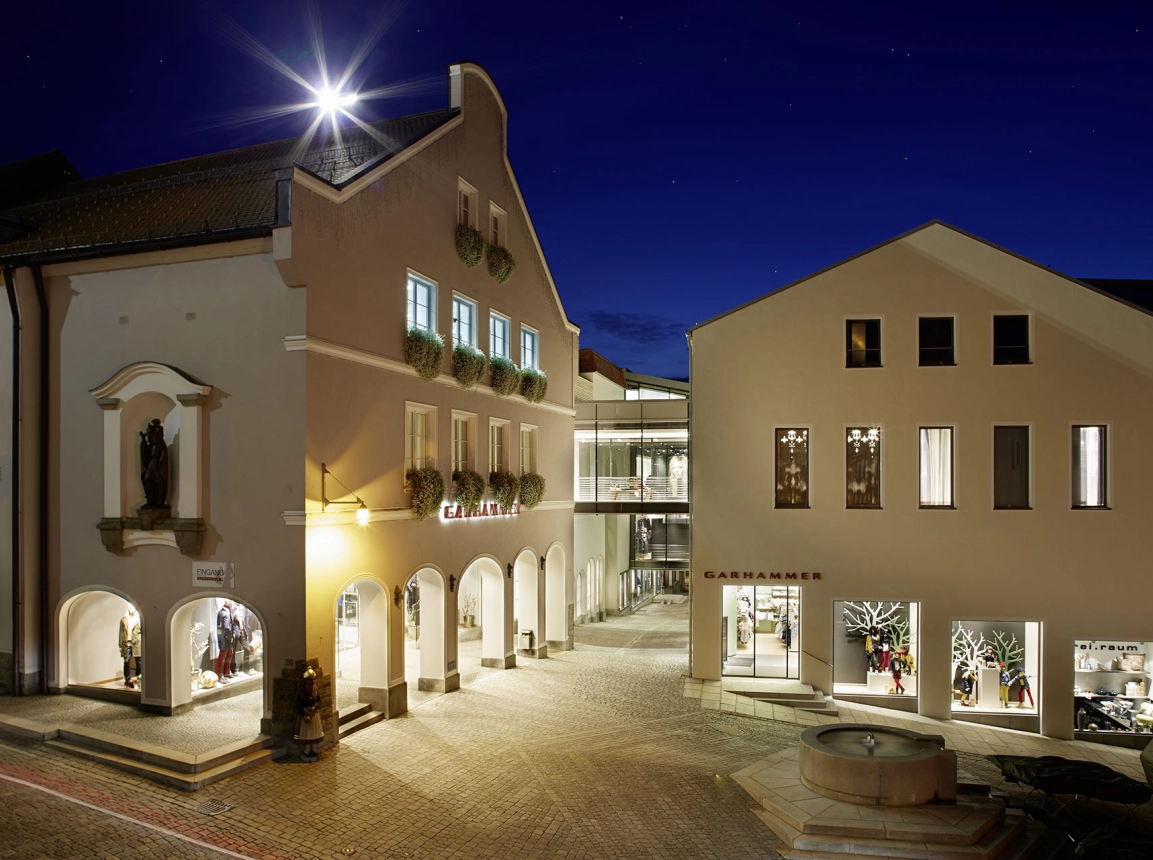
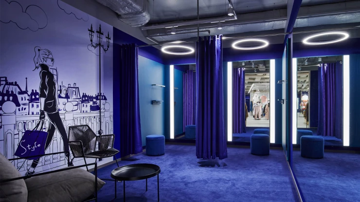
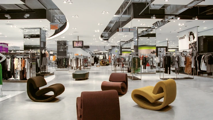
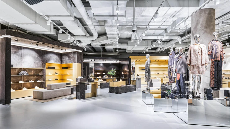
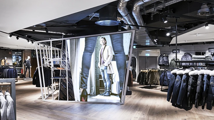
Whatever their standpoint, customers take in exciting vistas and absorb new impressions. One might say that the historic city centre, with its squares, its alleyways and stairways, has a friend in the new Garhammer. The roof landscape combines the historic and modern buildings like wings of a butterfly, before the joint structure gently slopes toward the northwestern edge of the property, leading to the new restaurant Johanns. The theme continues in the access areas, which link Garhammer to the urban space using multiple entrances, exits and passageways, making the retail store accessible from all sides. The interior is no less daring: Here, the creative use of varying ceiling heights, open spaces and sales levels leads to differentiated realms of experience.
Connected experiences
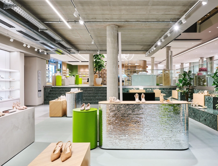
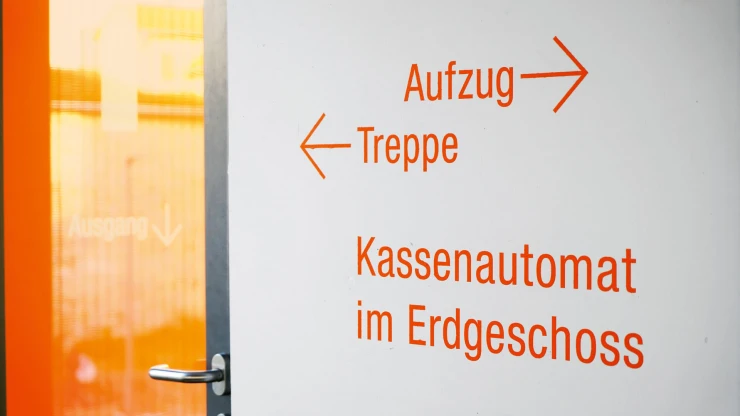
blocher partners ensured that customers not lose their orientation in the vast space. Given the slope of the Garhammer property, the architects and designers made playful use of the split-level format in the sales area. Of course there are staircases and lifts – but the charm lies in the abandonment of the classic floor construction.
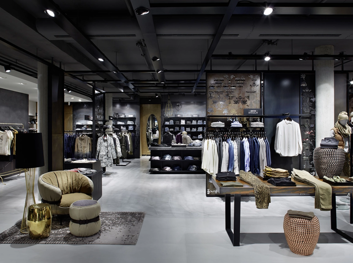
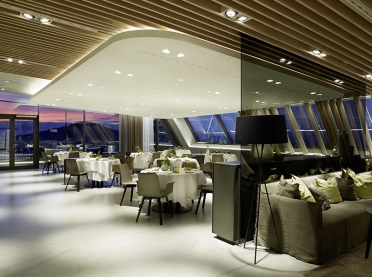
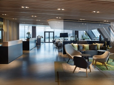
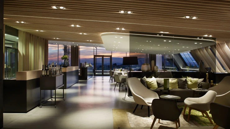
As a central connecting element, the staircase links all the levels, even as it varies stylistically: sometimes a simple landing stage; sometimes with multiple turns or gently curved staircases. The fact that, with all their fascination for detail, the planners did not lose sight of the project as a whole is also due to the mediation between architecture and interior design. Numerous points of reference make it easy to find your way in the house; be it on a particular floor or over several levels. For example, there are specific pieces of furniture placed near the entrances to stairways. While the front is decorated with products as usual, the back serves as a graphic indicator to customers. And there is another recurring theme in the new Garhammer: Tradition and modernity. They go hand in hand in this interior design concept. Garhammer exemplifies this duality: Big-city fashion is sold here with a down-to-earth Bavarian flair. So it makes sense that Johanns also reflects these values – the new culinary attraction high in the new building – with its wine cellier, lounge, restaurant and a roof terrace, which promises a sensational view.
