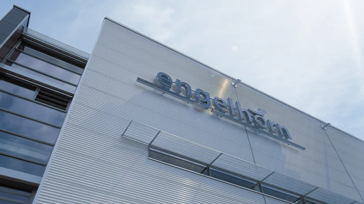
Conversion and redesign of the shoe department on the fourth and fifth floor plus champagne bar — O5.8, 68161 Mannheim, Germany — 800 m² — April 2022 — engelhorn KGaA
Always one step ahead
In a construction period of only three and a half months, blocher partners and engelhorn created an 800-square-meter shoe world for women and men. The new area is accompanied by a restructuring of the house. For example, the strict separation of accessories, which were previously presented in acc/ess, was dissolved and this building was more closely linked to the main building. This is now reflected in the consolidation and expansion of the product ranges, which have found their place on the fourth floor; in return, the high-quality shoe and accessory ranges previously presented here have been moved.
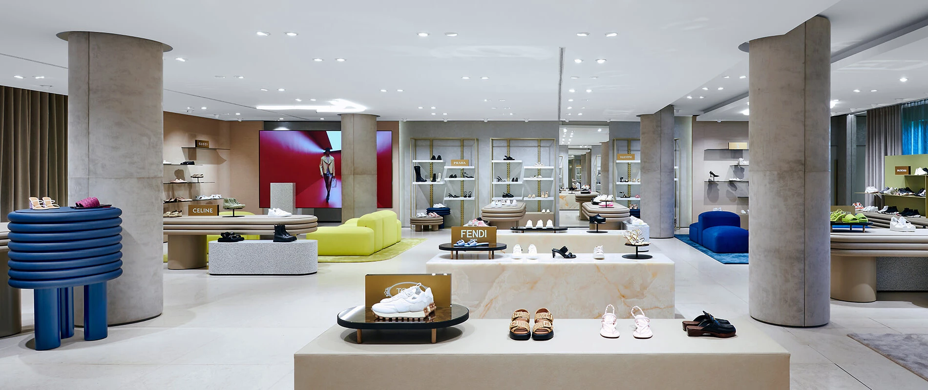
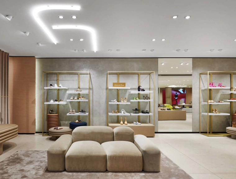
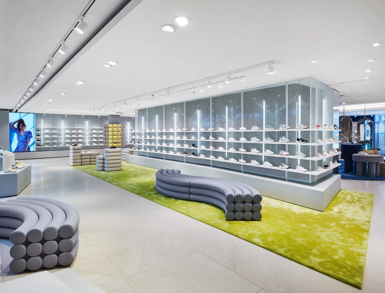
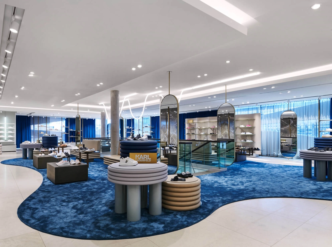
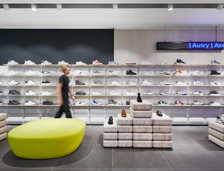
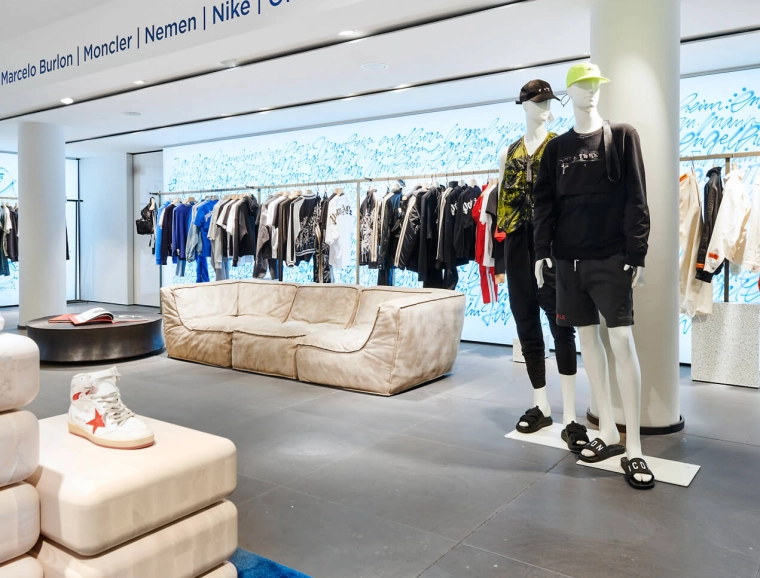
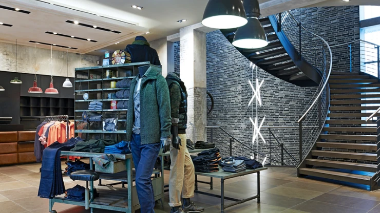
The shoe department is divided into three areas and extends over the entire wing of the building, including acc/ess on the left side of the main entrance. The high-end labels are found in the apartment, and pop-up areas create the transition into the sneaker world before moving into the lifestyle area in the acc/ess area. »Our goal was to dock with the existing architecture and achieve a spaciousness that integrates seamlessly,« explains Jutta Blocher, Managing Director Interior Design at blocher partners.
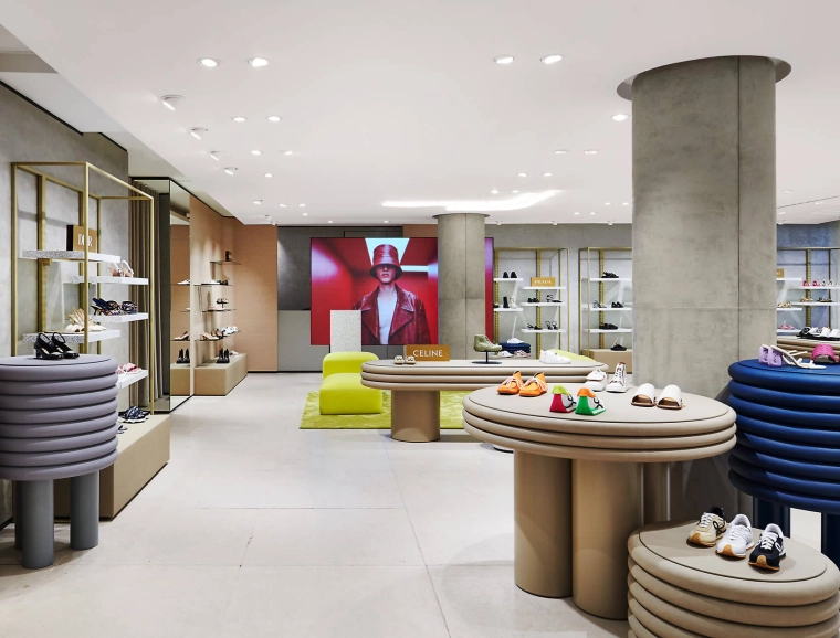
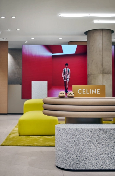
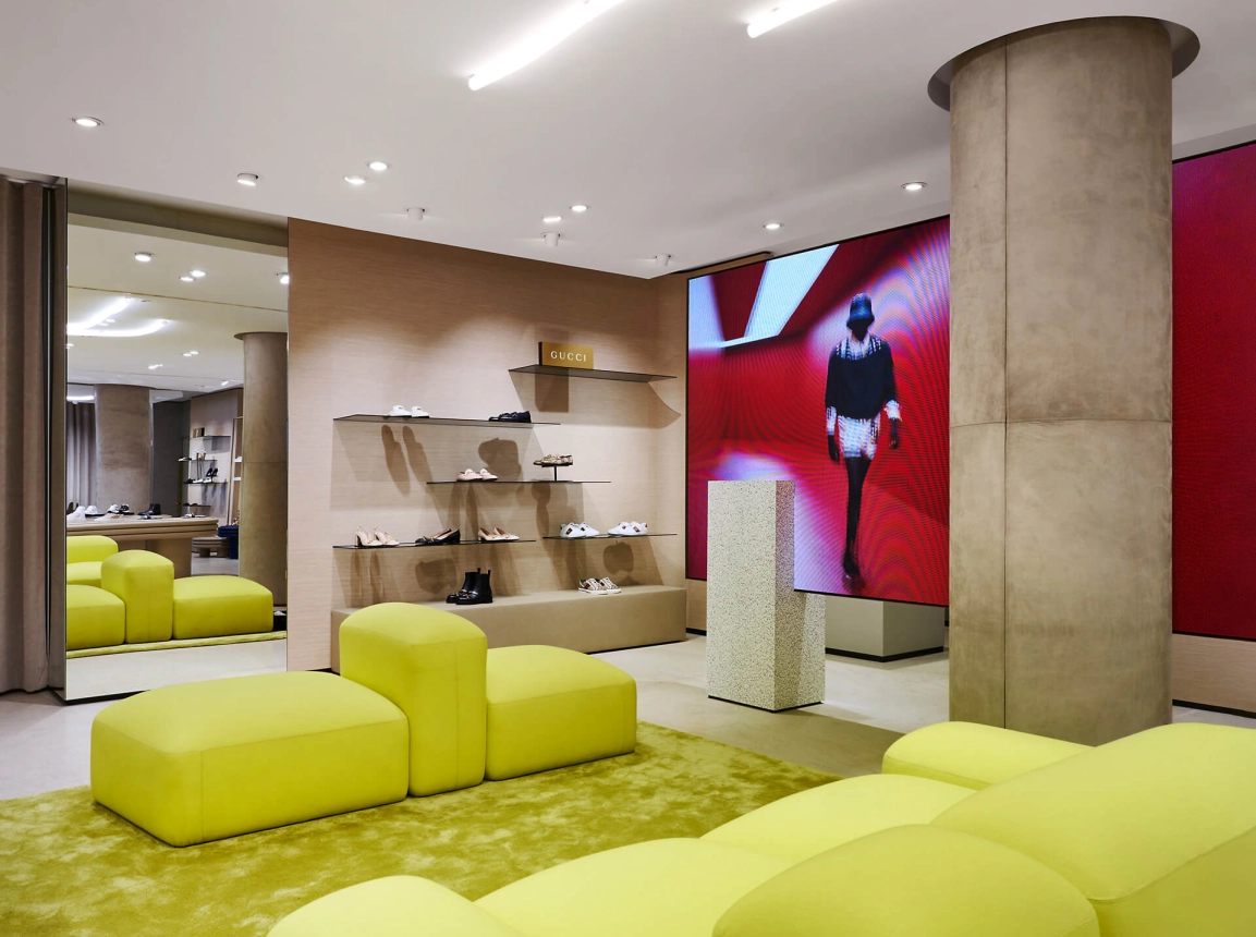
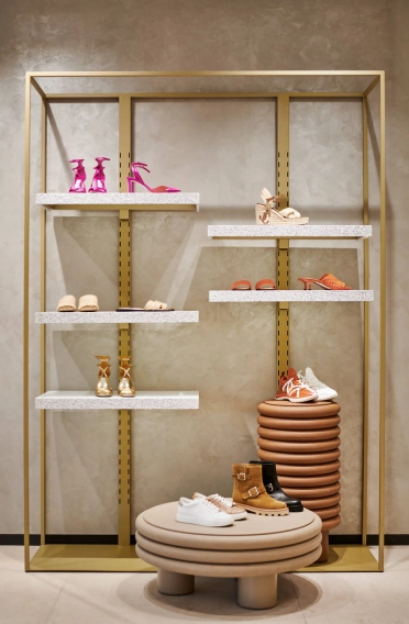
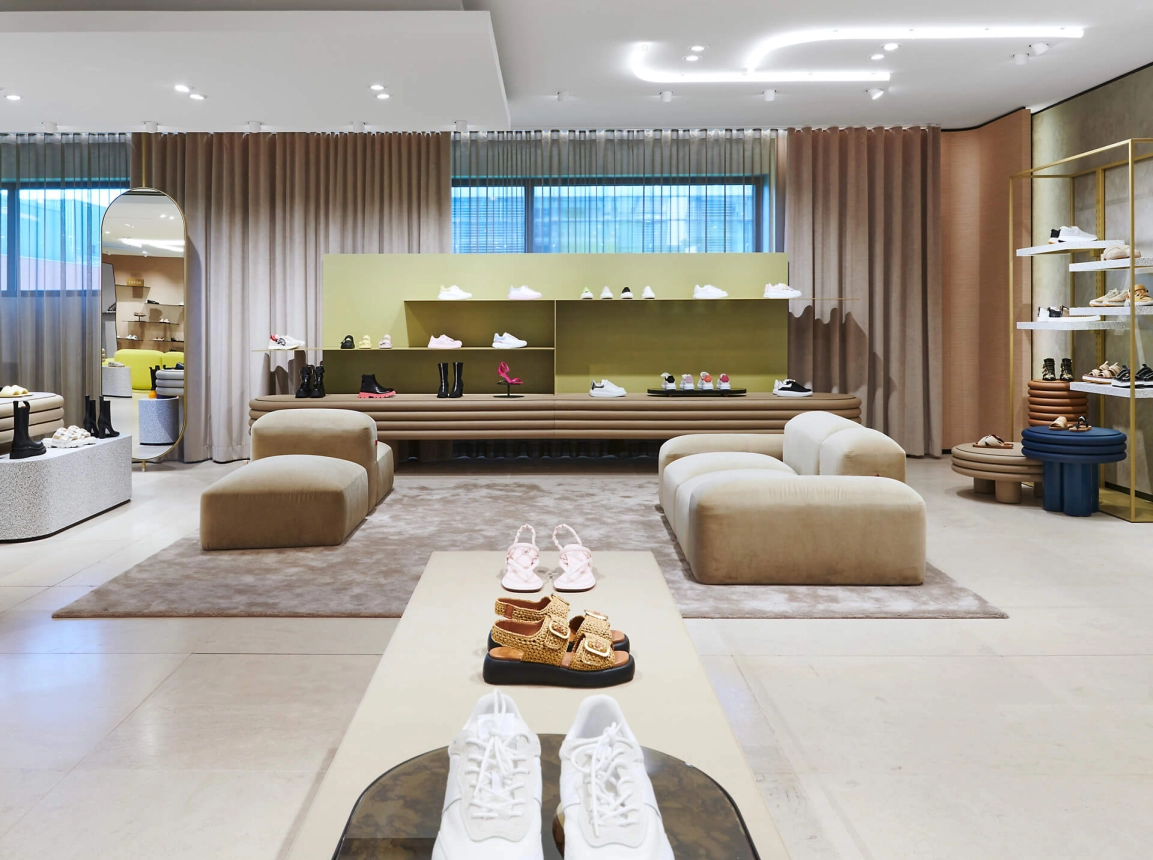
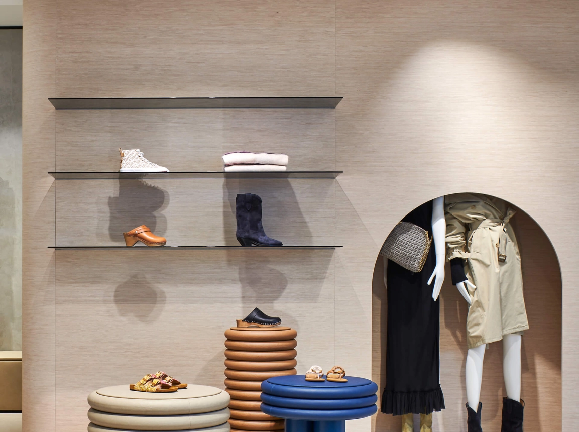
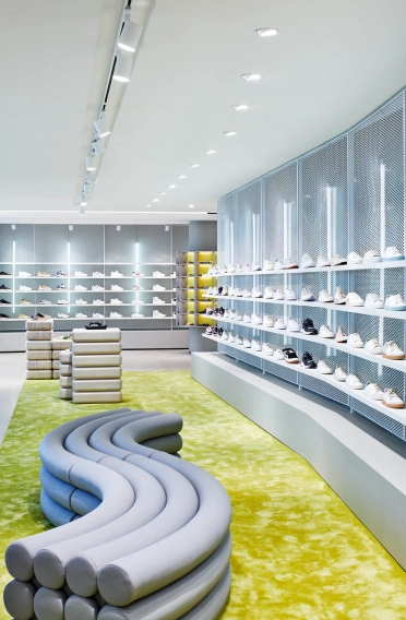
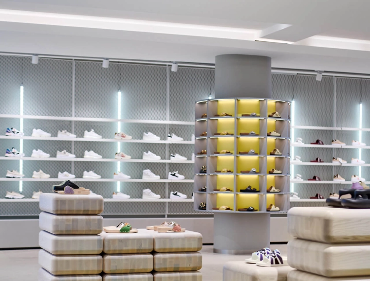
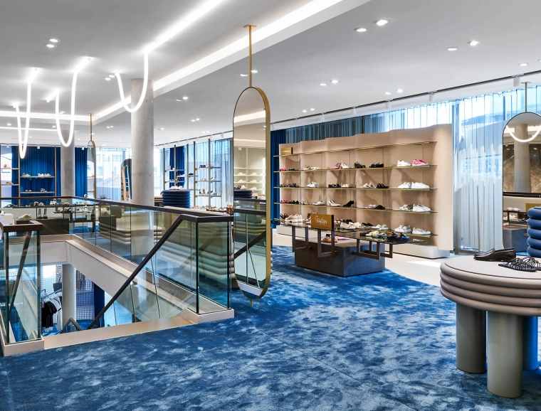
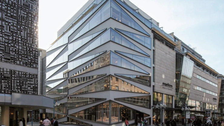
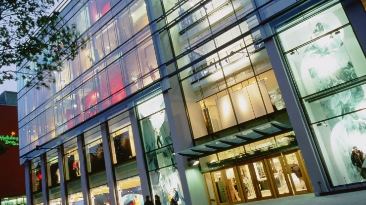
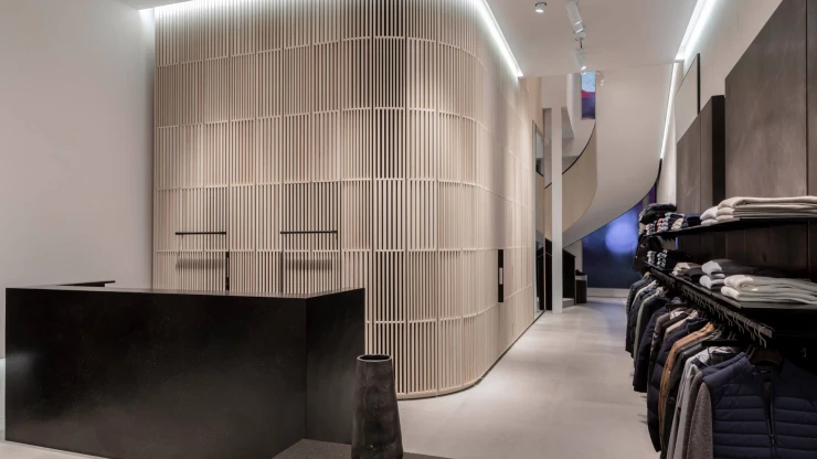
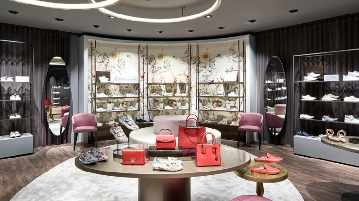
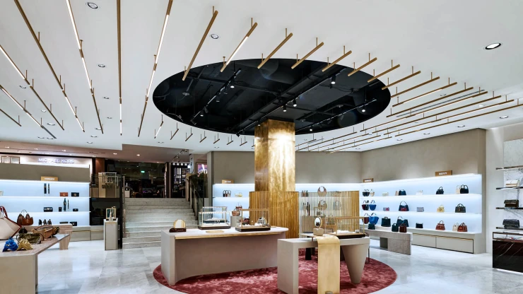
While the window front has always been open in the acc/ess, daylight now also falls through the open facade in the exclusive shoes area. This has an airy and spacious effect per se, and the design also follows this premise: Light, friendly colors, imitation leather and, above all, soft, round shapes shape the scenery. For example, feminine, elegant shades of gray, green and nude are increasingly used. These are effectively contrasted by purposefully placed champagne tones, terrazzo shelves and high-quality oak veneer. Nevertheless, in the spirit of sustainability, the interior designers have made a point of preserving existing features, such as the flooring, wall coverings, and leather-wrapped supports, or optimizing them, such as the ceiling lighting.
Spaciousness and organic design language
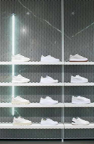
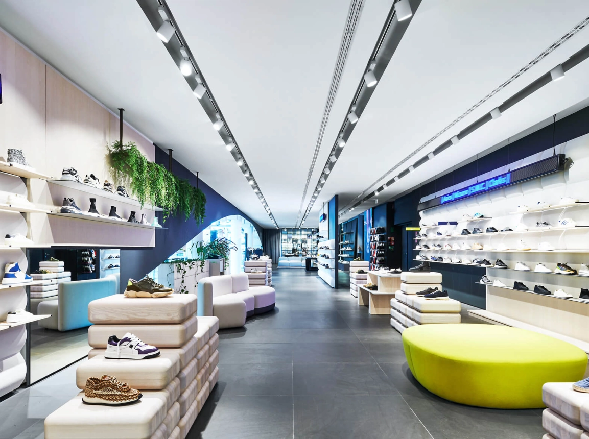
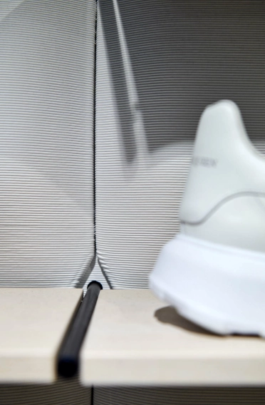
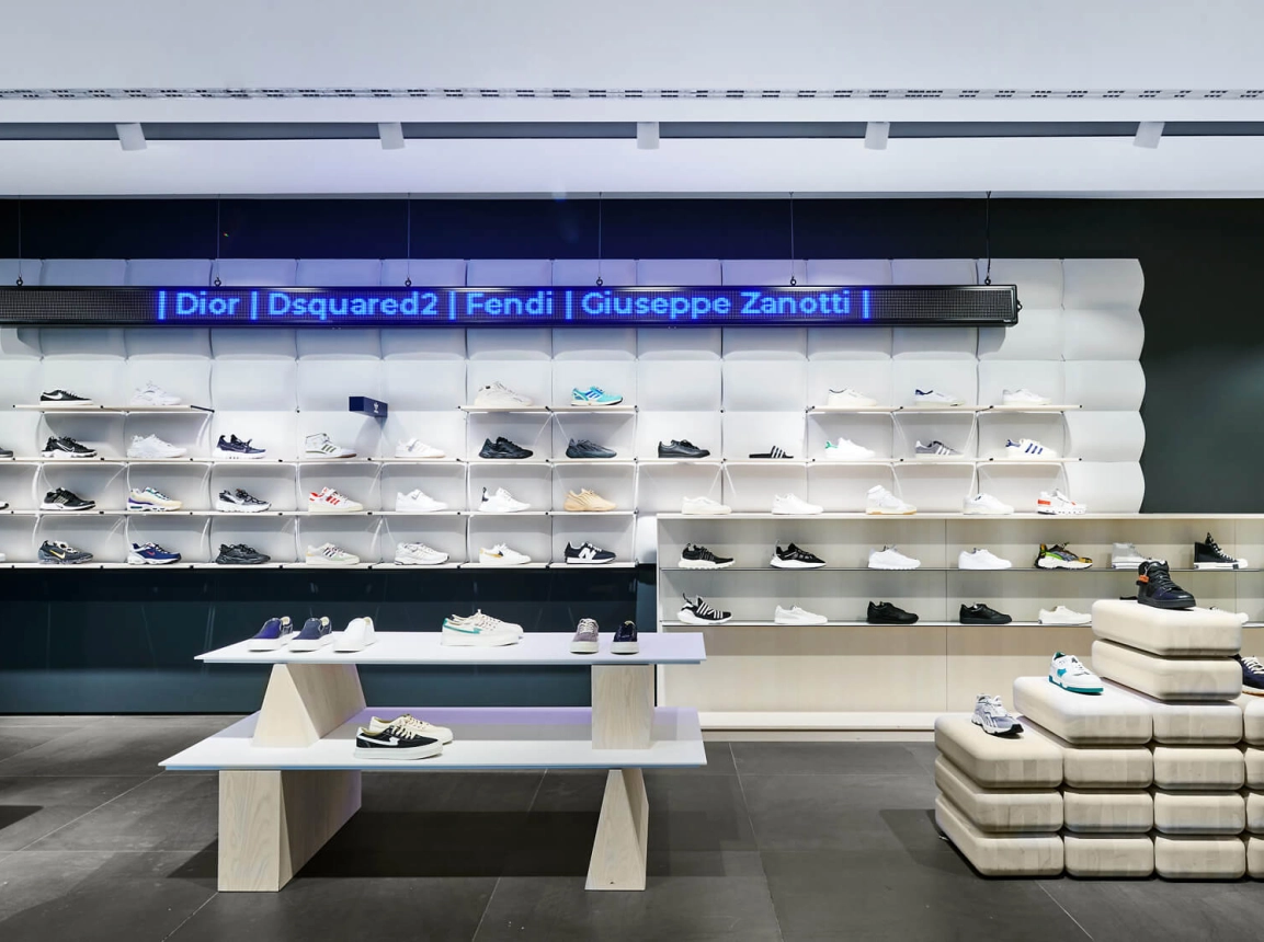
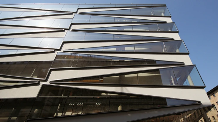
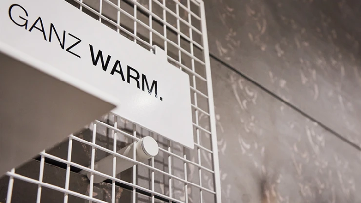
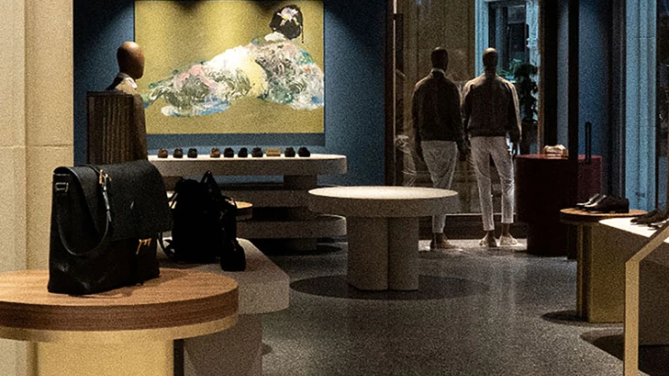
In other words, everything is spacious, airy, open, and flooded with light. This also applies to the lifestyle area, where the colors are somewhat stronger with accents in petrol and cognac. Progressive is the expanded metal supplemented with lighting, which gives the existing marble cube a completely new look. Incidentally, this also applies to the façade, along which the expanded metal and, as a visual highlight, a wooden wave lamella are also used, while on the opposite side the glass lamellas installed in 2007 now shimmer instead of being presented in shades of green as before. With a concrete look and white powdered expanded metal, the modern appeal continues in the sneaker area.
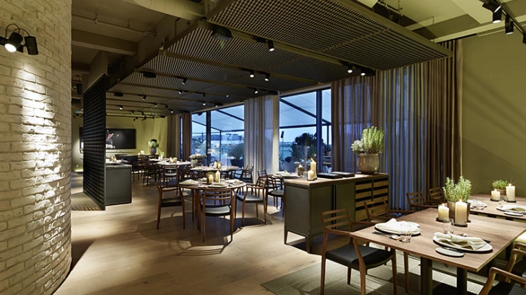
The furniture of the three areas unite in their organic design language. The brands read like a who's who of the industry: in the luxury sector, for example, you'll find Prada, Gucci and Dior. The transition to sneakers is made by brands such as Acne Studios and Isabel Marant. In terms of sneakers, classics such as Adidas and Nike dominate, while in the lifestyle sector the diverse range includes Kennel & Schmenger, See by Chloe and Hogan. The interior designers have also placed a lot of emphasis on comfortable seating, which invites customers to try on clothes but also to take a rest. For those who also like to have a refreshment, the new champagne bar, which is located in the air space, is the right place to be.
