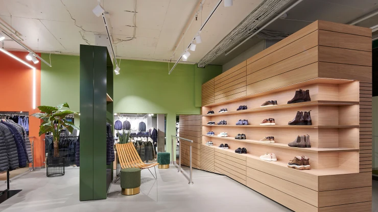
Redesign of the premium department for handbags and jewelry — Marktstraße 1-3, 70173 Stuttgart, Germany — 1,200 m² — September 2020 — E. Breuninger GmbH & Co.
Space for the extraordinary
How do you create a shop design that reflects the high quality of luxury products without robbing them of the scope to appear to their full effect? With the new design for the jewelry and leatherware department of the Breuninger flagship store in Stuttgart, the interior planners at blocher partners has come up with an impressive answer.
Virtually no other German fashion house is as synonymous with luxury and premium brands and an exclusive shopping experience as is Breuninger. The foundations for the impressive history of this family-run company were laid in Stuttgart in 1881 with the opening of the first of what became 11 department stores. The company’s success is down, not least, to its unwavering boldness in consistently treading new ground – ground that has brought change and which has called for the design input of blocher partners on multiple occasions since 1992. The same now goes for the redevelopment of the premium segment on the ground floor of the Stuttgart flagship store, whereby the interior designers took care of some aspects of the coordination of the designer sales areas and the overhaul of the jewelry and leatherware section.
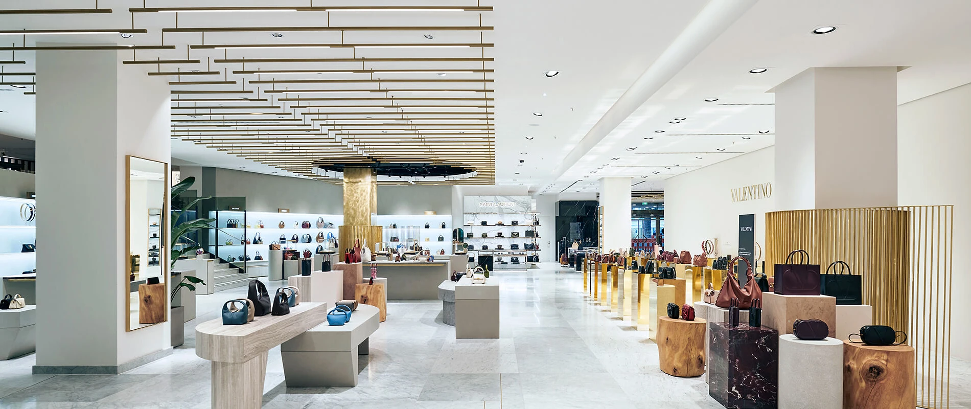
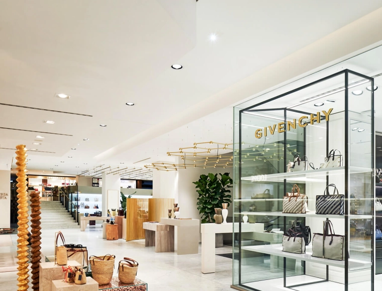
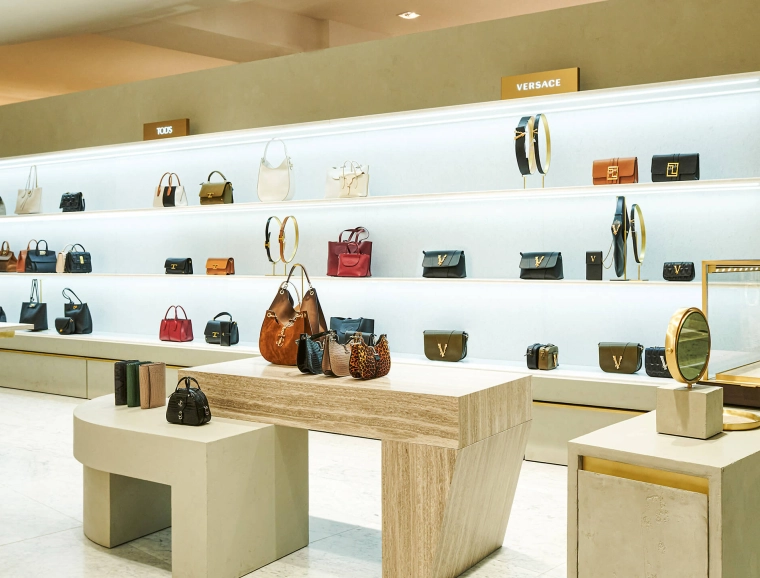
Purist and with a certain sophistication, the sales floor boasts a limited range of colours and materials. The light, natural stone floor, which was part of the existing interior, in combination with walls that have been kept white, creates a sense of immense breadth. The furniture in the middle takes various forms and materials, such as natural stone and exposed concrete, and thus creates the impression of monoliths placed in the expanse of the space.
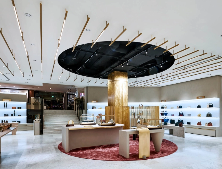
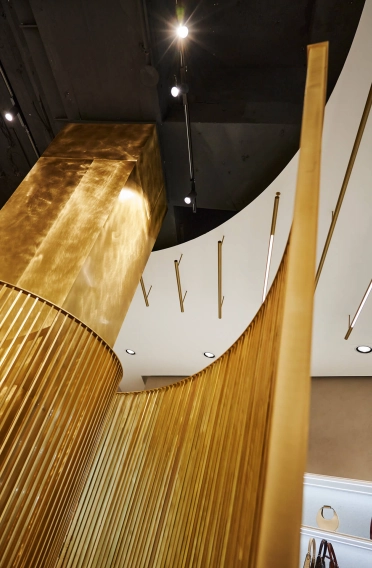
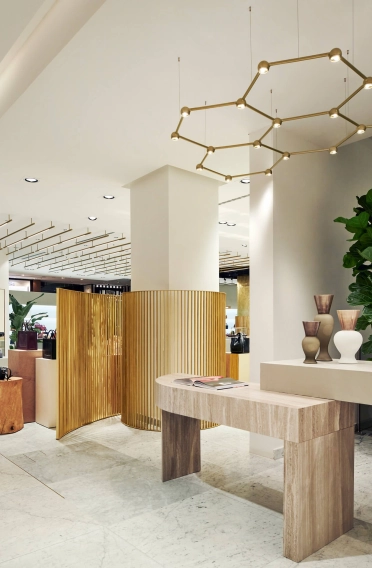
The contrast of the somewhat rough materials of the mid-space furniture and its slightly edgy appearance is tempered by velvet armchairs and isolated colour accents. The highlight of the interior is undoubtedly the red carpet in the middle of the sales floor, with the pleasing detail being that the round form of the carpet is reflected in the ceiling, which has been left open at this spot. Directly behind it is a pillar that the interior architects have clad in brass and thus turned into a striking statement feature. Its impact is emphasized by a similarly brass-coloured screen, which winds around the pillar in spiral form.
Luxury shopping and a feel-good atmosphere
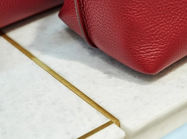
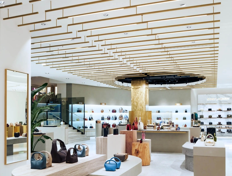
The brass cuts through the overall interior design concept like a clear line and is therefore also reflected in slender strips in the floor and on the ceiling: Long, narrow LED strip lights hung beneath the ceiling lead from one side of the room to another and create a horizontal counterpoint to the vertical goods presentation on the rear walls.
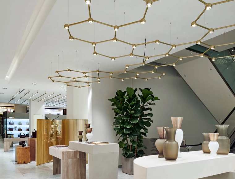
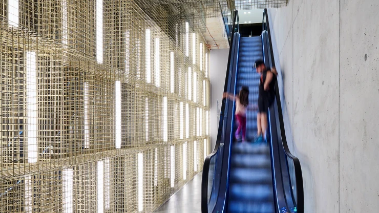
With their lighting curation, the interior architects fully exploit the potential of light: Hence, for example, at the rear where the escalators are located, they have used gold-coloured Favo lights from Sattler. With a honeycomb structure, they create a network of many small dots of light and thus bathe the room in an atmosphere of warm light that is softly reflected back by the natural stone floor. Despite the expanse of the space and the minimalist style, with their shop design the interior architects have succeeded in bridging the gap between the luxurious-seeming store the Breuninger name stands for and an exclusive shopping experience in a feel-good atmosphere.
