Redesign of the children and sports department — Kärntner Straße 19, 1010 Vienna, Austria — 1,600 m² — October 2020 — Kaufhaus Steffl Betriebs AG
Futuristic design meets tradition
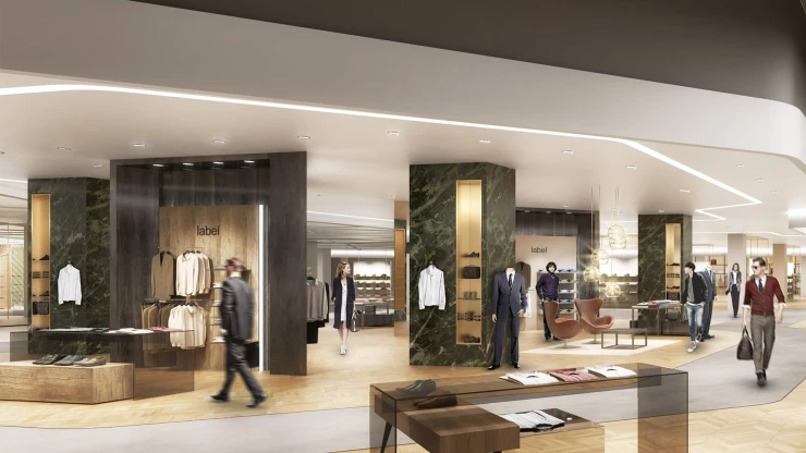
The city of Vienna is known for its State Opera and St. Stephen's Cathedral, two main landmarks. And there’s another kind of landmark not far away: Kaufhaus Steffl, which has always attracted urban fashionistas and aficionados of style. With their redesign of Steffl’s sports department and the total renovation of its children’s department, blocher partners interior designers have brought futuristic design to a company with strong traditions.
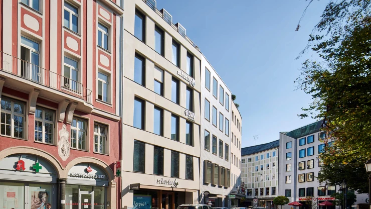
Its selection of high-end and premium fashion makes Kaufhaus Steffl fit right in on Vienna’s prominent Kärntner Street, alongside the boutiques of renowned luxury labels from around the world. But it also stands out from the rest, because it’s named after Stephen's Cathedral, which locals like to call "Steffl." The nickname underscores the special status of this traditional store.
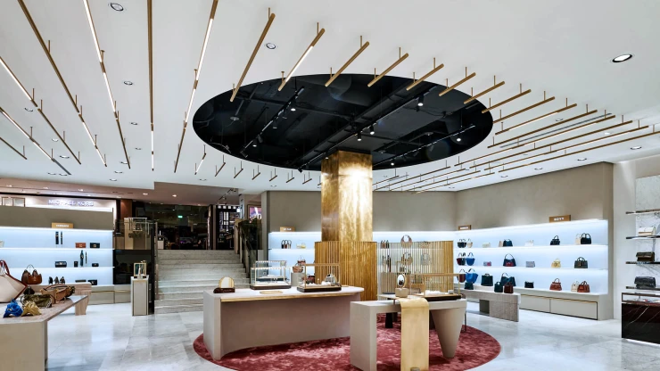
On 13,000 square meters, spread out over nine floors, Steffl offers a full shopping experience, from its exclusive selection of styles to its highest quality service concept, to moments of enjoyment and relaxation in the Sky Café and Restaurant. The blocher partners interior designers were commissioned to add a completely new sports department on the fourth floor, and to revamp the adjacent children's department.
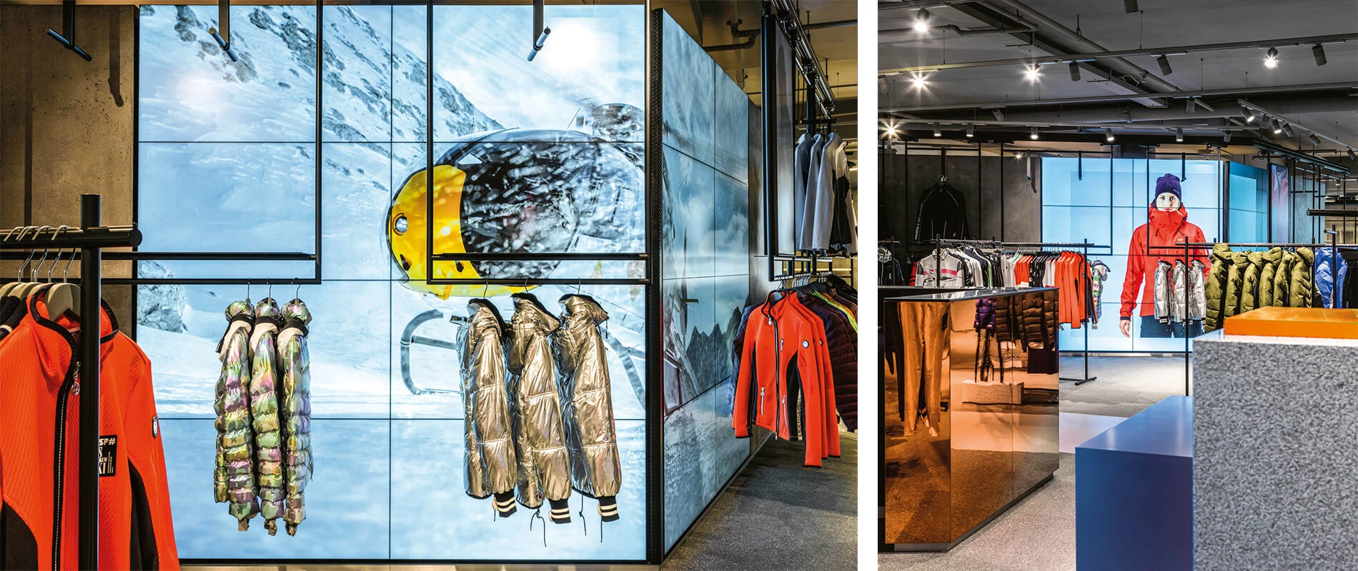
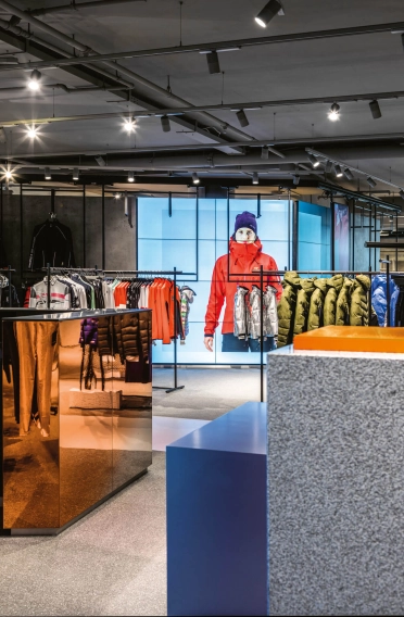
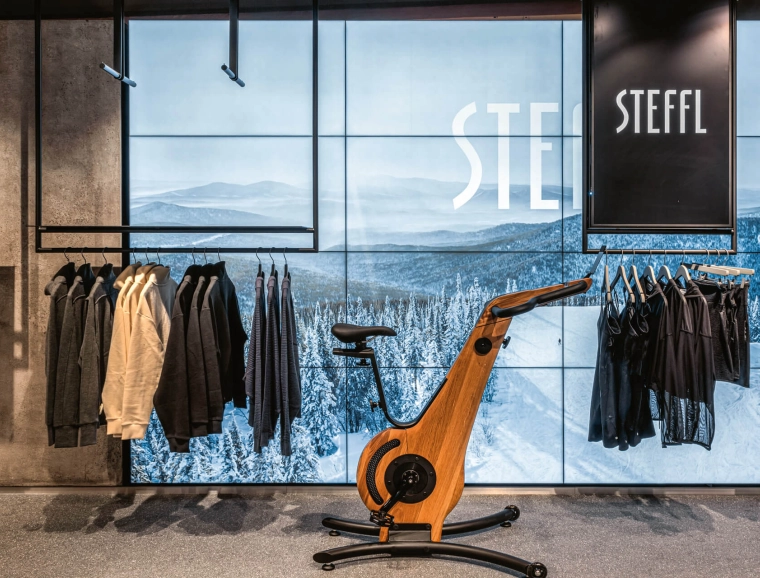
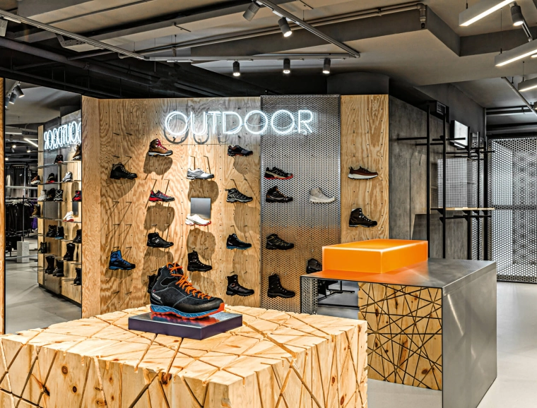
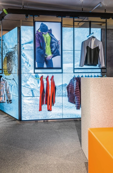
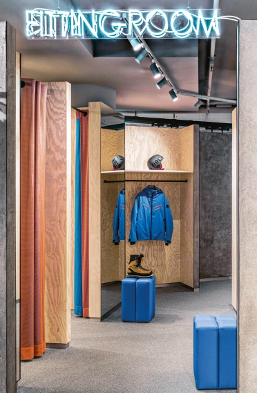
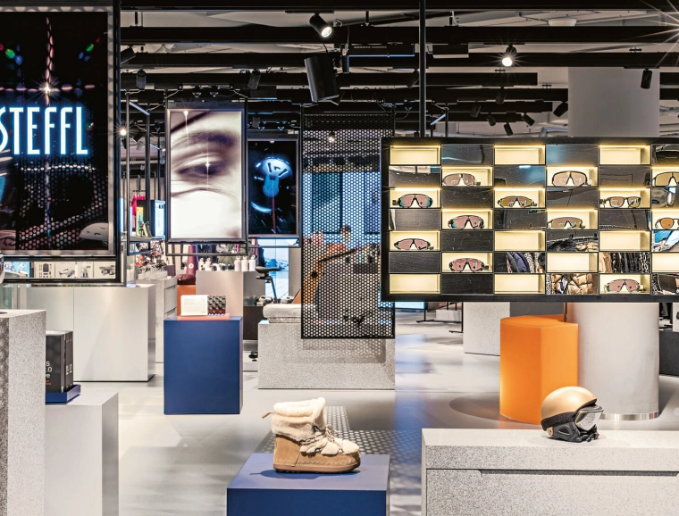
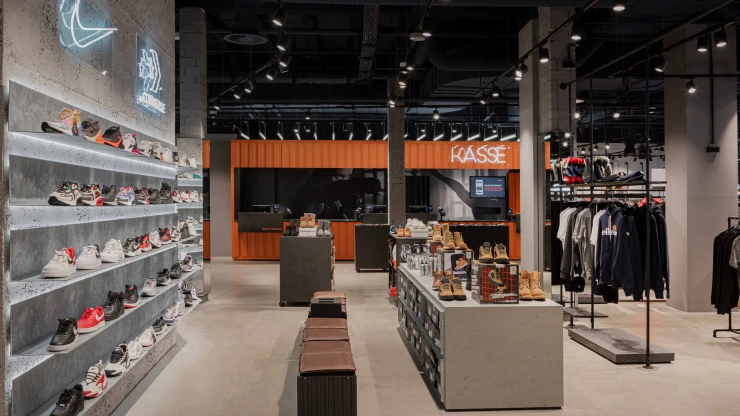
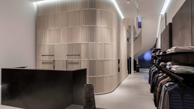
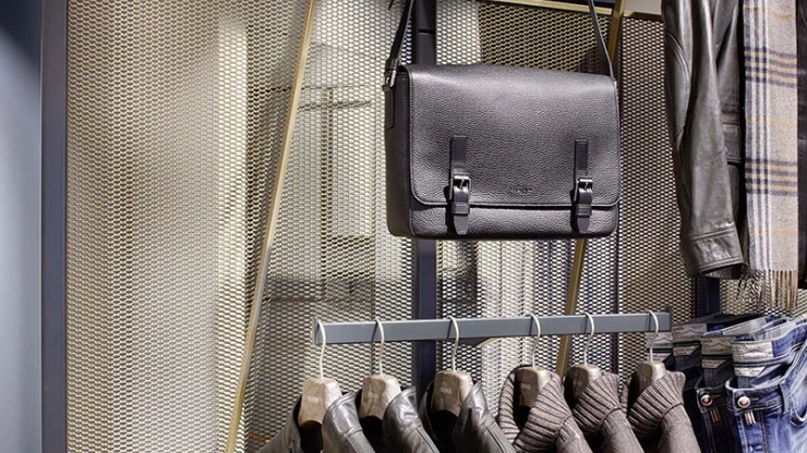
No sooner do visitors step off the escalator on that floor, than they are swept up in the futuristic world of the sports department, which is distinguished by an interplay of aluminum and perforated sheet metal, granite and Plexiglas. Special furniture placed in highlight areas put a local spin on fine art, with an emphasis on Swiss pine and high-class workmanship. But the interior designers were also keen on playing with contrasts on another level: In order to ensure a shopping experience that would impact several senses, they superimposed various media to create an unusual depth of detail in the presentation of wares. Products and monitors are suspended from flexible ceiling levels above the so-called Inspiration Island; the monitors play eye-catching content on both sides. Additional screens offer a digital presentation of merchandise.
Even the checkout area will wow visitors. Welded from lacquered stainless steel and then over-painted with an intense color that morphs from orange to blue, the back wall of the checkout area reflects the entire department.
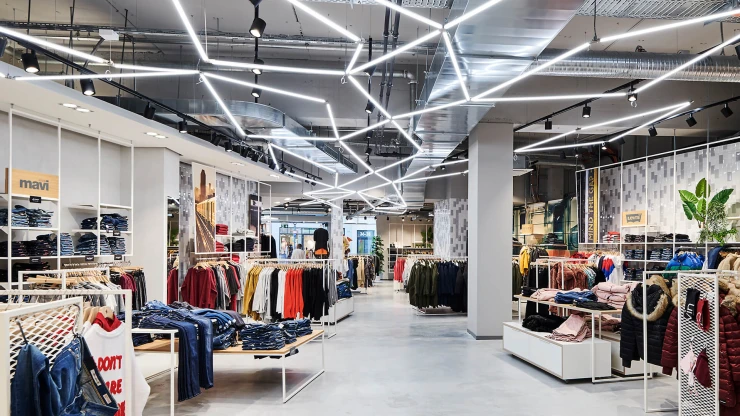
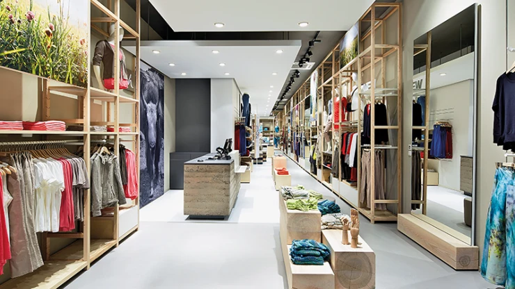
The adjacent children’s department has a similar look – it leans toward the cool, rather than the childishly cute. Here, too, the interior designers used aluminum and perforated sheet metal, aiming to connect Scandinavian cosiness with a futuristic feel. Each individual section features slightly different colors and materials. In the department for infants and toddlers, the perforated sheet metal is complemented by mirrored walls or wood. Artemide lights highlight entrances and special displays.
Playfully creative, the interior designers came up with something unusual: In the middle of the sales area, they placed a workshop with a large table and hanging frame. It can be used to display merchandise or to suspend a movie screen.
