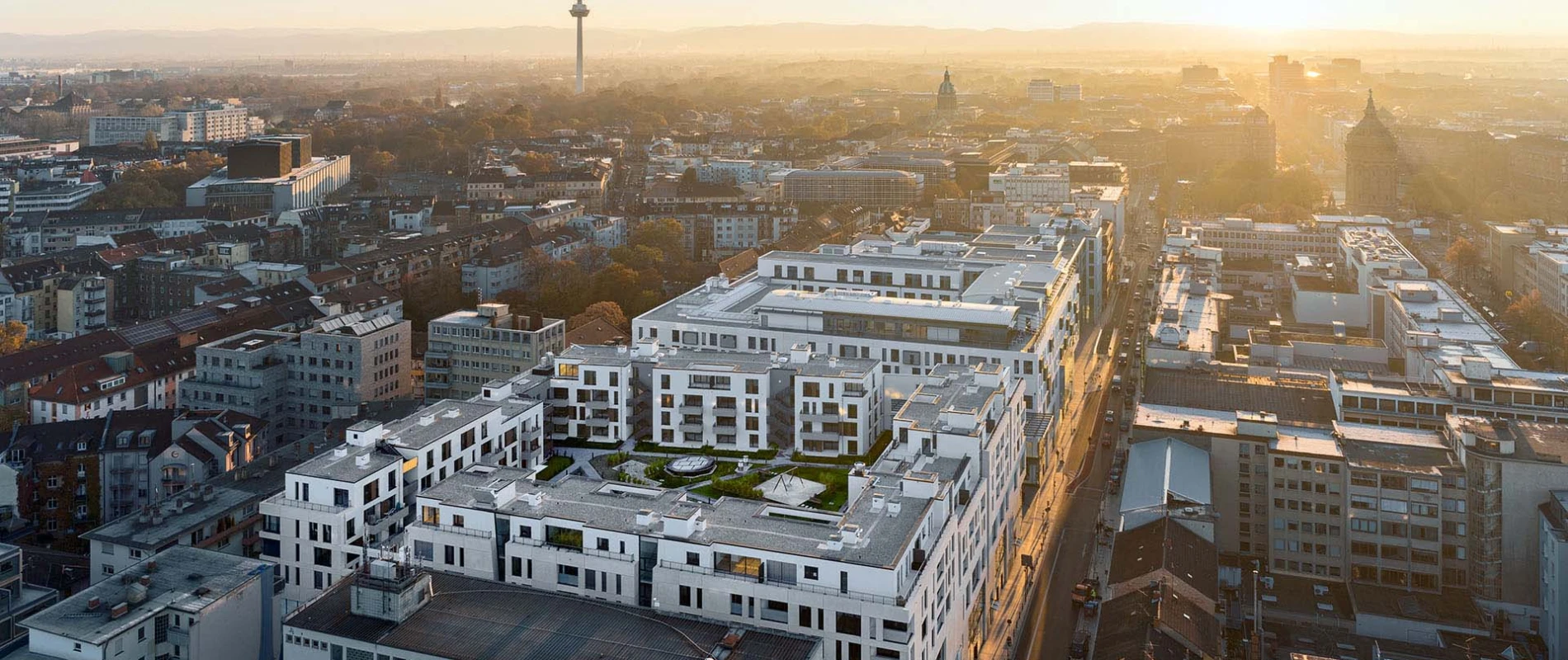
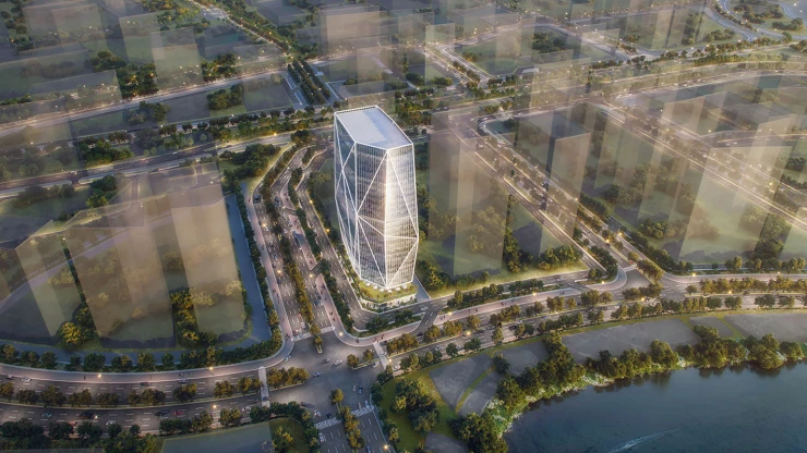
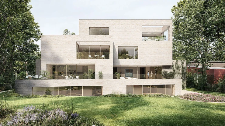
New construction of a mixed used quarter with shopping gallery, restaurants, apartments, hotel, wellness and health facilities as well as offices and underground parking — Q6/Q7, 68161 Mannheim, Germany — 153,000 m² — 09. 2016 — Diringer & Scheidel Unternehmensgruppe, Mannheim
Façade structure blends the individuality
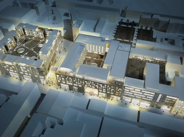
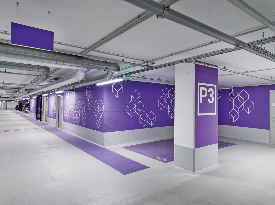
What’s fascinating about such a large grouping of buildings is that one can’t grasp the whole complex from a single perspective. We always see only segments. Since 2007, blocher partners has been collaborating with the Diringer & Scheidel Unternehmensgruppe. Its accomplishments include Orientation system, communication design, naming.
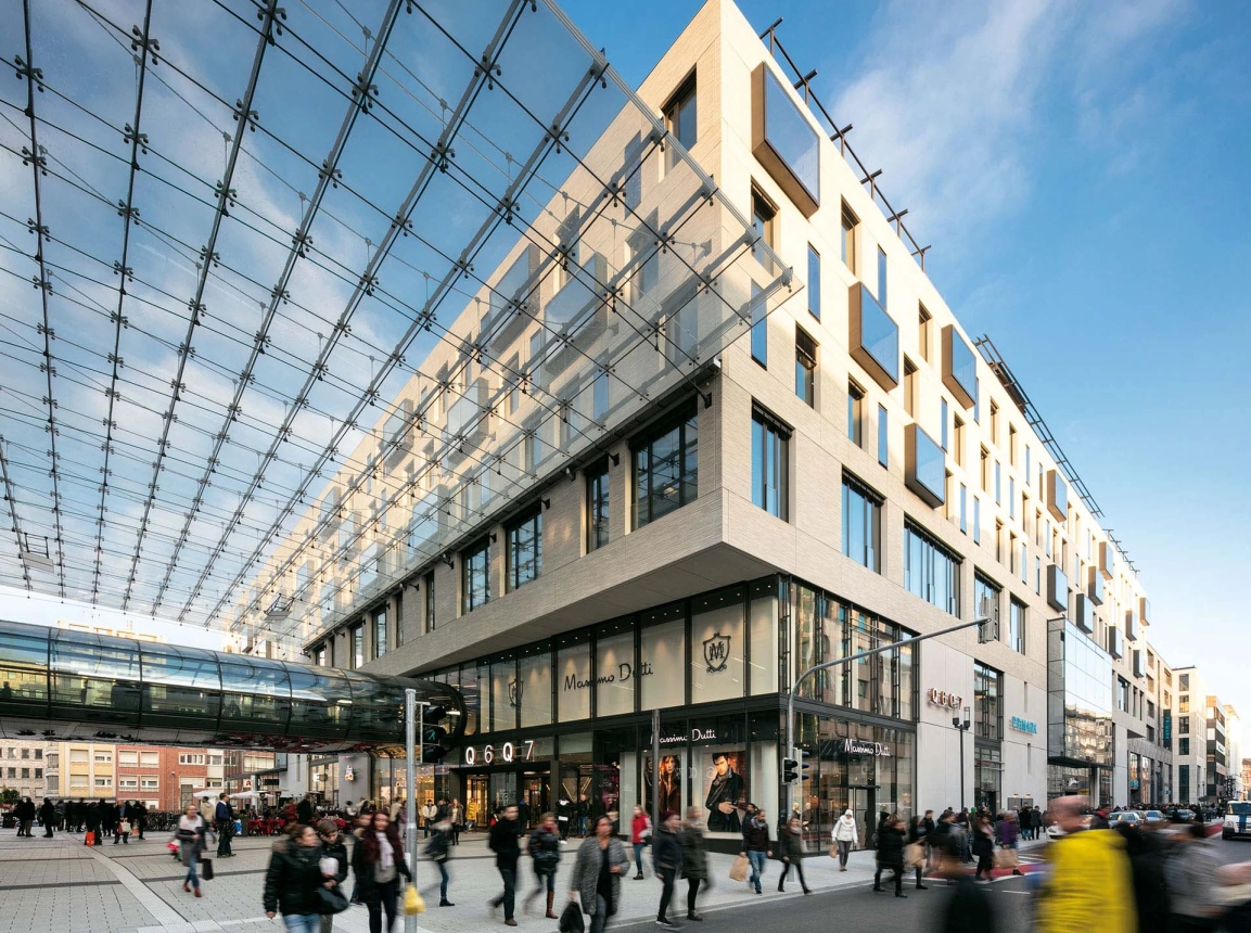
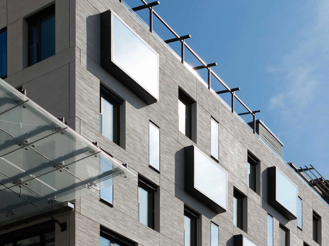
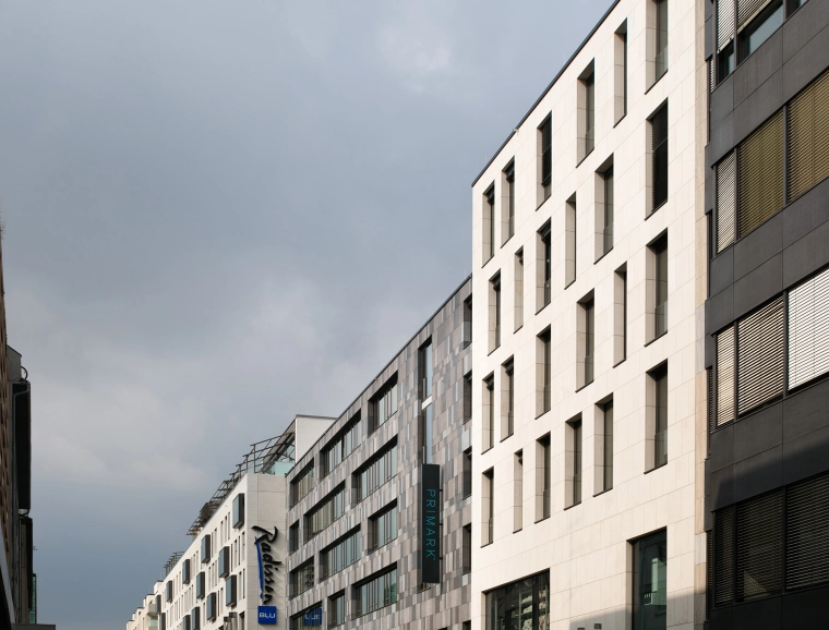
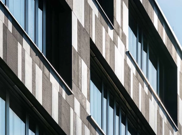
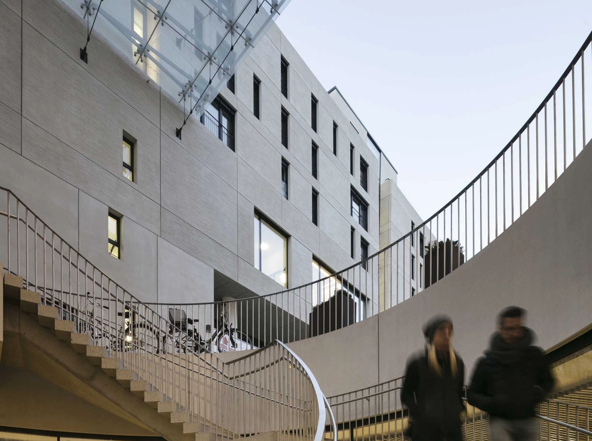
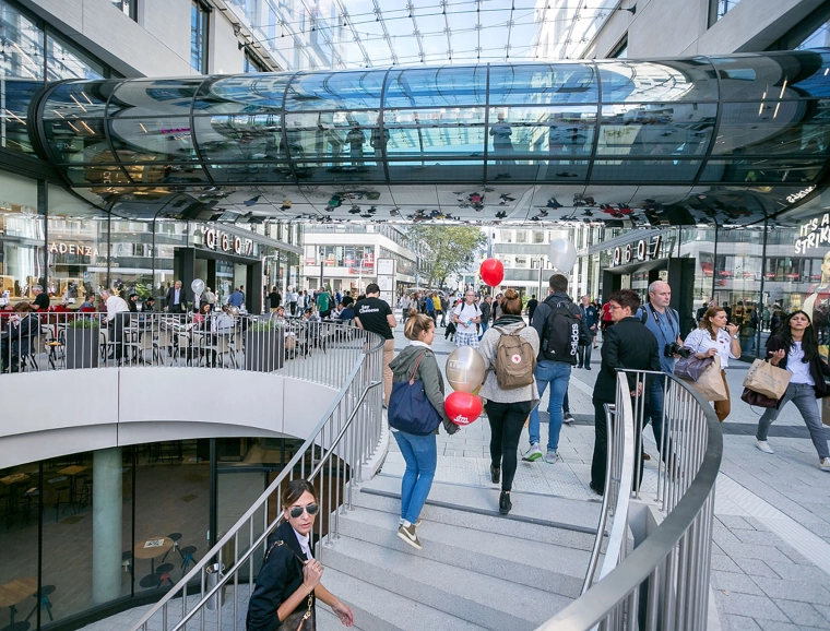
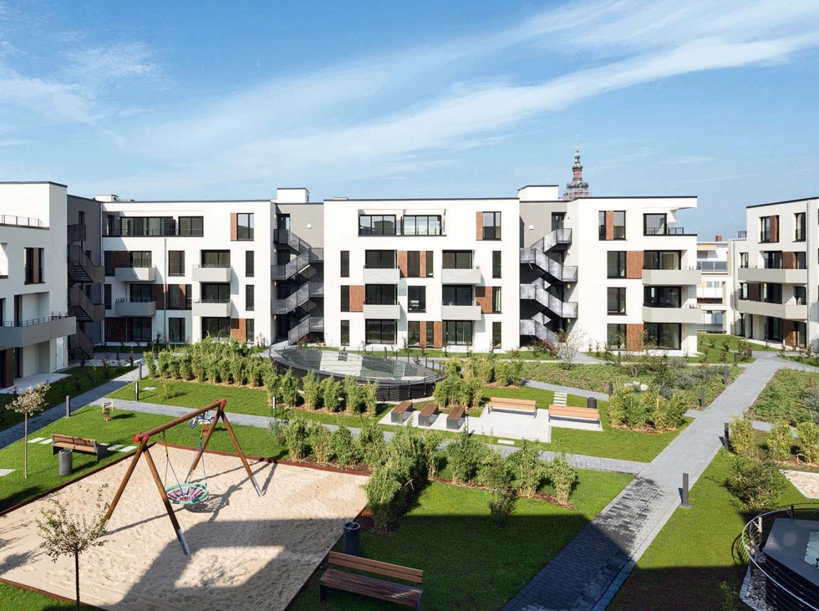
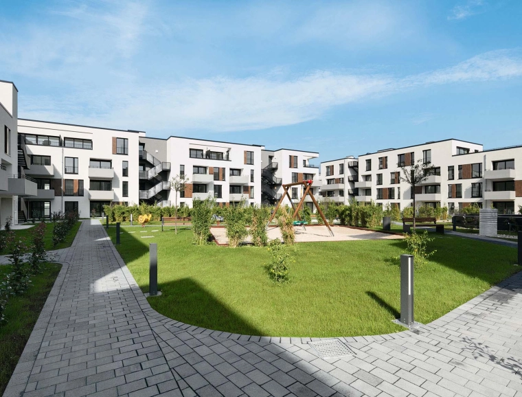
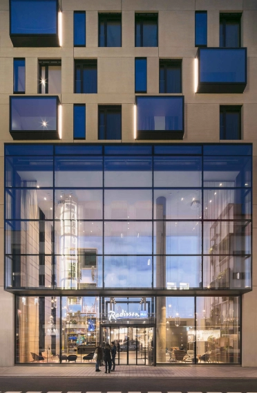
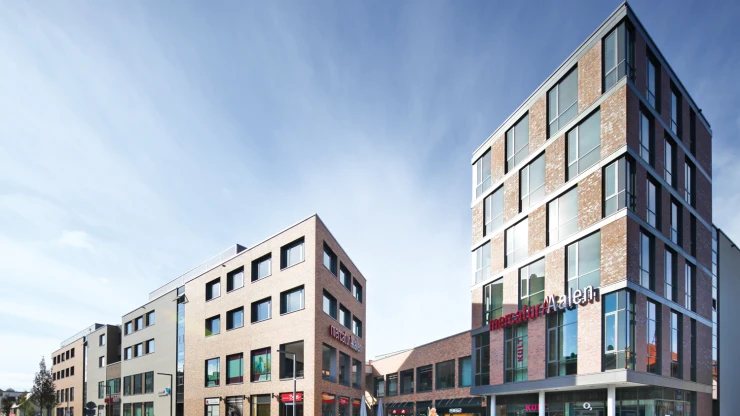
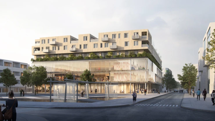
But when we superimpose our various perspectives, a more complete picture emerges. The façade provides hints about what lies behind it – from the inviting glass façade of the ground floor zone to the protective wall surrounding apartments and hotel rooms, a classic perforated façade, whose stone structure blends the individuality of Q 6 and Q 7.
The building shell always communicates with the ground level
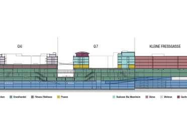
The building shell always communicates with the ground level, despite the largely glass-covered, two-storey base zone, which clearly defines the areas dedicated to business. For example, the Q 7 block, where the square structure is absent, is enhanced by the hotel building structure, which is set apart in depth and structure: an imaginary square, the fraternal twin brother to Q 6.
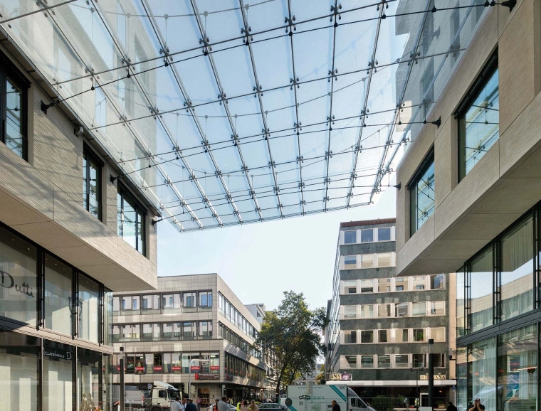
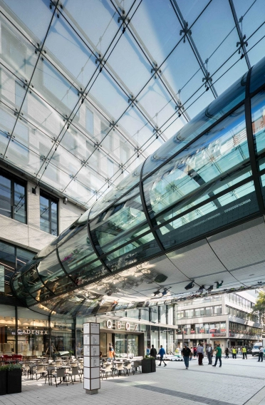
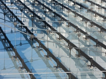
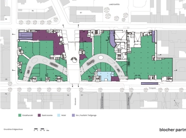
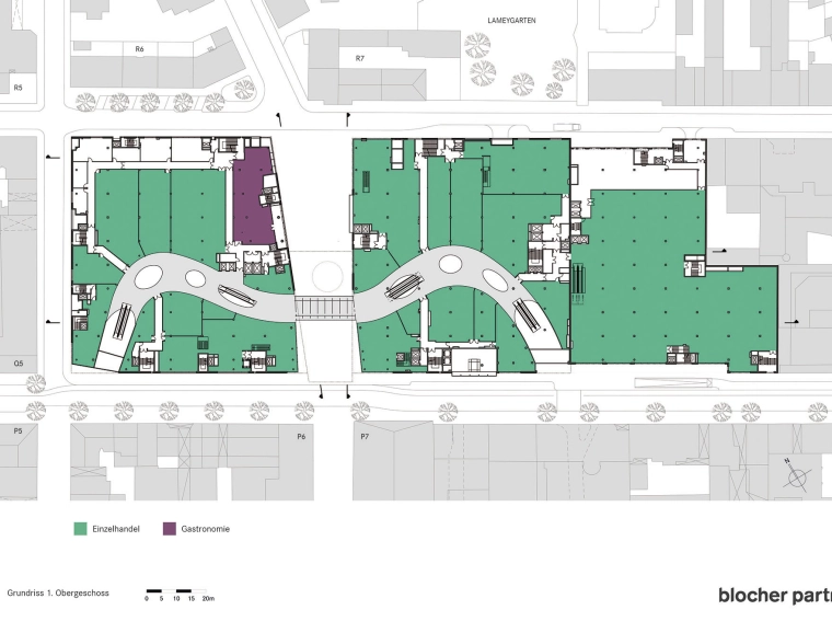
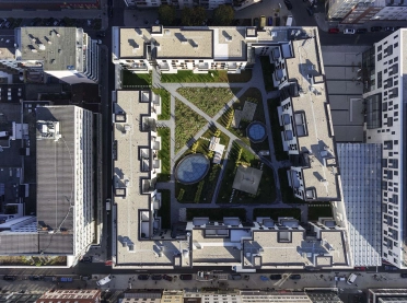
Heading toward the water tower, where Kleine Fressgasse Street once was, the quadratic structure deconstructs, becoming more differentiated and complex as it reemerges in the façade and the scale of the stone envelope. The two squares, literally twins, seem to dance together with outstretched arms – in the form of the glass filigree bridge. The choreography describes a gesture opening out to the space. A hint of a roof – a cable-supported glass membrane – floats protectively above. Its appearance, which extends over the building line, highlights from afar the urban-planning space that is so unique for Mannheim’s square structure, connecting Q 6 and Q 7 on the circular line where the town gardens were located to the south.
From an urban competition planning to a city module
For about ten years now, blocher partners have taken part in the planning and development of various aspects of the project Q 6 Q 7.
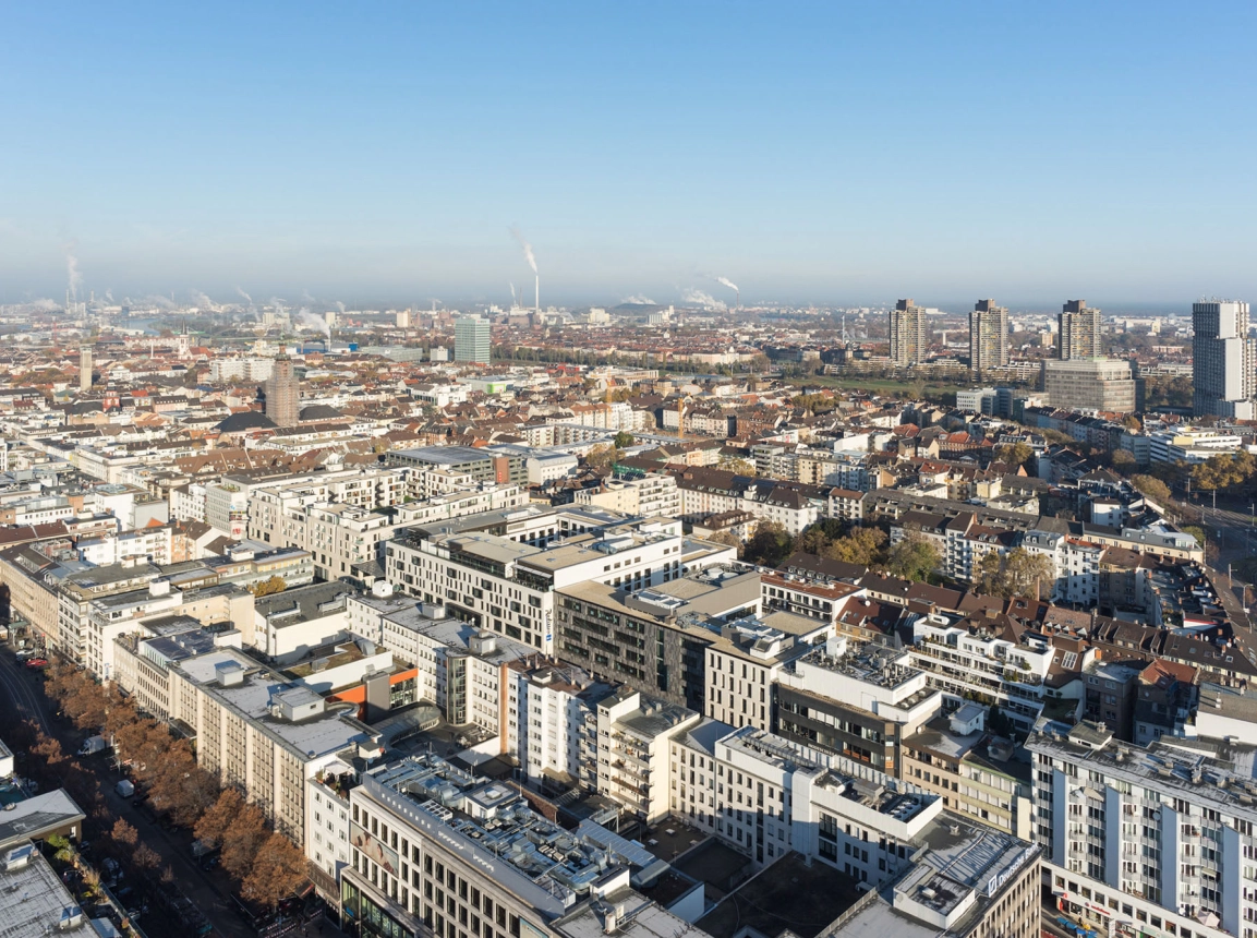
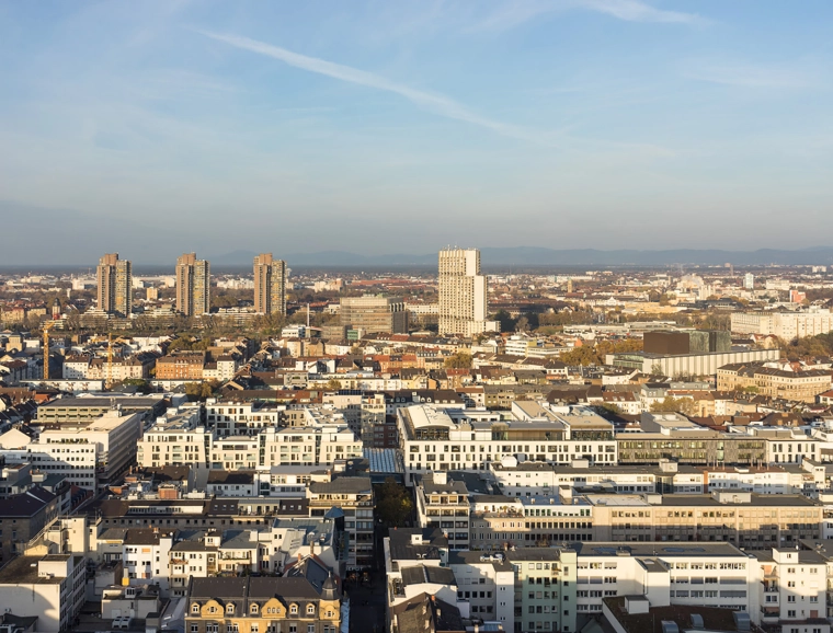
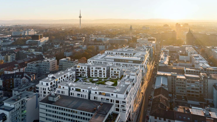
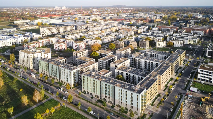
Ten years generated by one idea – the urban planning competition for reconstruction of the urban structures destroyed in World War II. The result is the city district Q 6 Q 7 where we now stand: a so-called hybrid structure. And today it’s hard to imagine a time when this neighbourhood didn’t exist. Today, people are shopping here, drinking coffee, meeting after work, visiting the doctor, playing sports, parking their cars and even reserving a hotel room – or living here, looking out above the rooftops of the city.
Perspective changes with every step
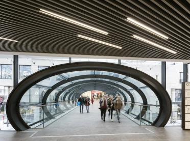
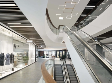
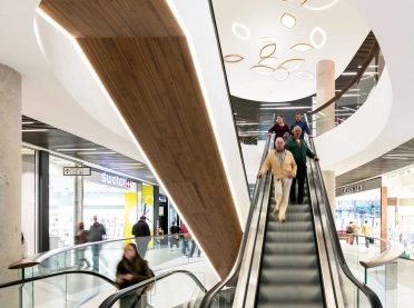
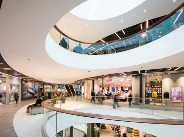
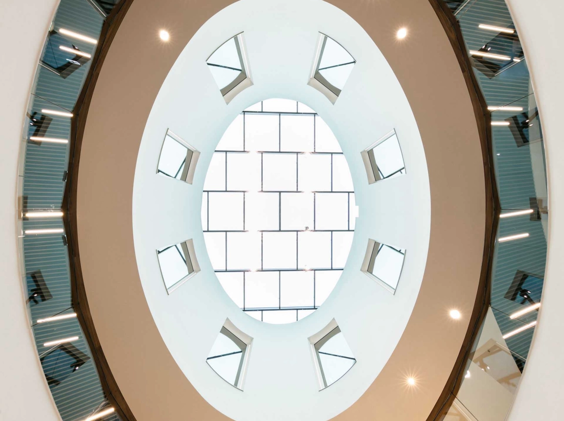
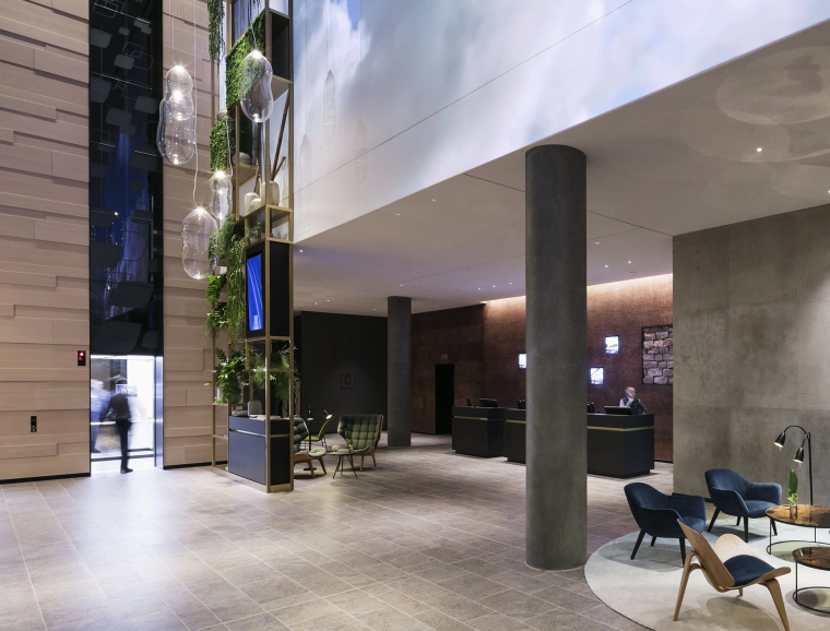
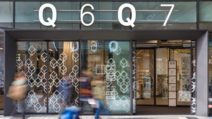
At Q 6 Q 7, the perspective changes with every step. Right at the entrance, an escalator takes visitors to the first floor, where the glass connecting bridge leads to the other part of the building. The horseshoe-shaped passage encourages pedestrians to continue on and make new discoveries. The eye travels over natural stone and anodized bronze signs, which lend warmth and value to the space, then seeks out the floors above, which are linked through oval recesses in the ceiling.
Overlapping uses for an utilization around the clock
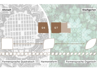
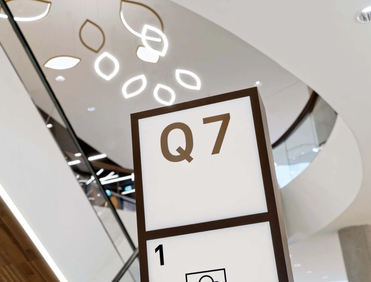
Q 6 Q 7 is a new kind of urban cornerstone, one that brings life back into the core of Mannheim – and not just during the workday. Here, overlapping uses make for an energetic, optimal utilization around the clock. Even more important are the sociocultural aspects, such as improved social control in a city that is also active at night, and reduced car traffic. Shopping is within walking distance, social and cultural contacts are nurtured, and barrier-free living is possible. Now that’s sustainability. The guidance system that leads through this vertical city pays homage to the past. Running through Q 6 and Q 7 – in the days of old – was a tree-lined lane that linked the old city with the municipal park. This inspired our communication designers. Q 6, anchored in the structures of the old town, is represented by squares. Q 7, respectively the park, has a leaf-like shape. Where they meet stands the shape of harmony, the melding of square and leaf.
