Orientation system, communication design, naming — 153,000 m² — Q6/Q7, 68161 Mannheim, Germany — 2016 — Diringer & Scheidel Unternehmensgruppe
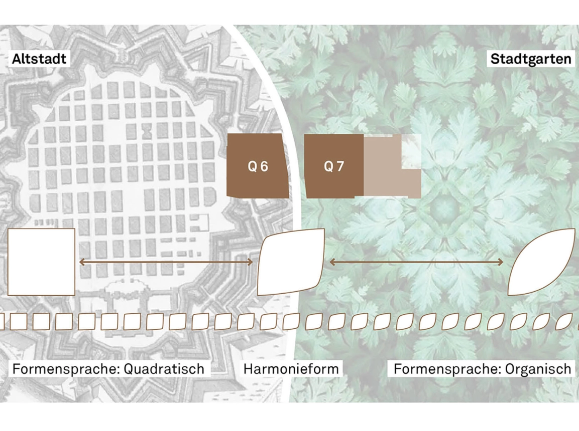
Square + leaf = harmony
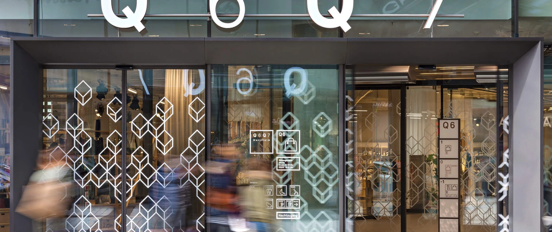
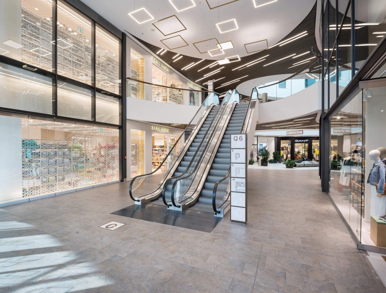
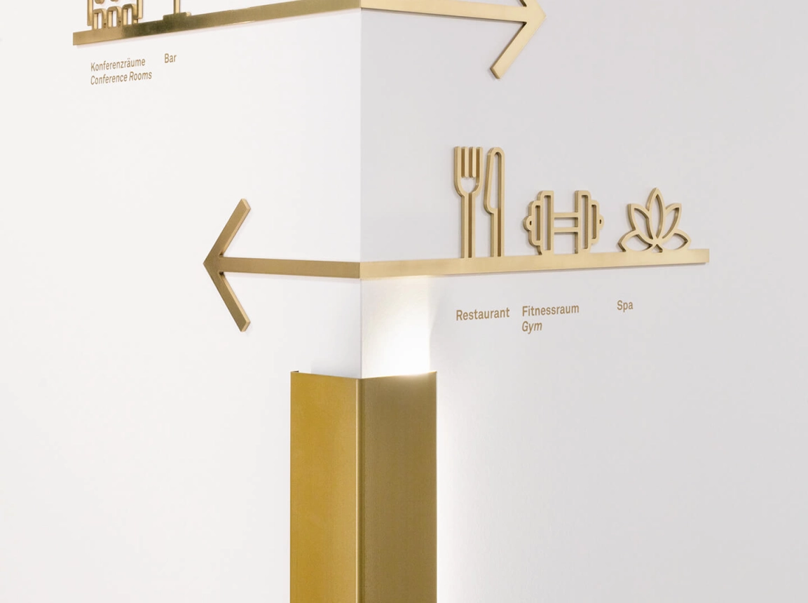
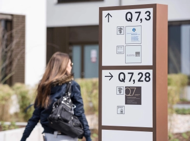
The requirements of a orientation systems are high: it must enable an intuitive orienatition but also has to be integrated seemlessly into the architecture to subtly fostering the relation of location and men. Not only the vast extent of Q 6 Q 7 with over 153,000 square metres was a special challenge but also the variety of different uses - from shopping to living.
Since 2007, blocher partners has been collaborating with the Diringer & Scheidel Unternehmensgruppe. Its accomplishments include the new construction of a mixed used quarter with shopping gallery, restaurants, apartments, hotel, wellness and health facilities as well as offices and underground parking.
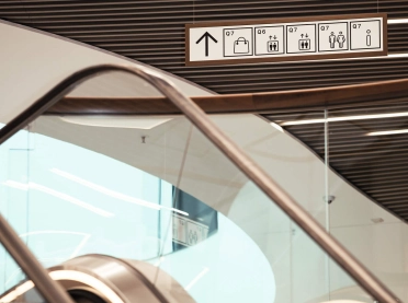
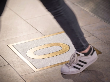
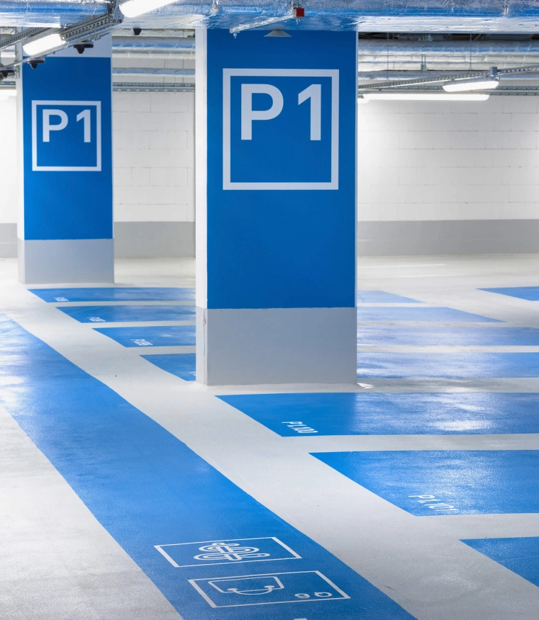
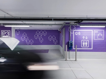
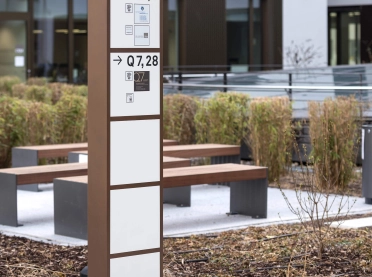
To solve this problem the designers created a unique system of square and stylised leaf-like elements. One side represents the building in the Q6 square and follows the geometric grid of the old city of Mannheim. The organic side stands for the historical urban park and for the Q7 square. Where both buildings meet, the shapes melt into an iconographic harmony form. These ormanets can be found everywhere within the quarter, as furniture and lamps, but also as wall graphics and orientation elements. typenraum together with Eva Rosenberger added a second layer to this scheme: an elaborate system of distinct, internationally comprehensible picograms and harmonic, clear colors that reliably guide the visitors from the underground garage up to the roof. The result of the close cooperation of typenraum with the architects and interior designers at blocher partners: a seemless, intuitive spatial experience.
