Leonhard Filderstadt – Corporate Design
Corporate Identity
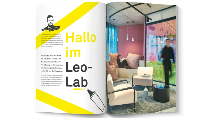
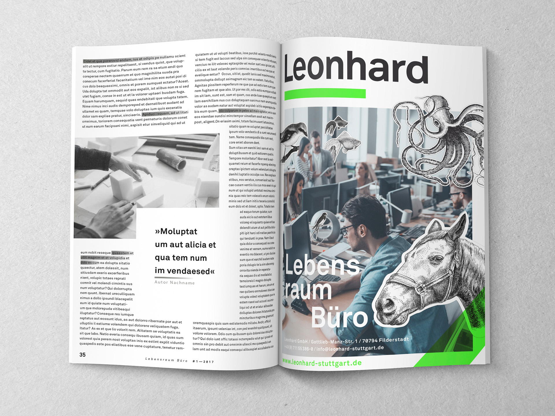
Working Worlds 4.0, Coworking, Design Thinking: Leonhard GmbH – one of the most innovative office and property designers and planners for working environments – knows that innovation starts with spatial planning. And they applied it to themselves, as well. Their complete Corporate Design overhaul is based on the Claim »living space office«. By the way, this title is also found on the in-house periodical magazine, which typenraum brings to life with print and graphic contents.
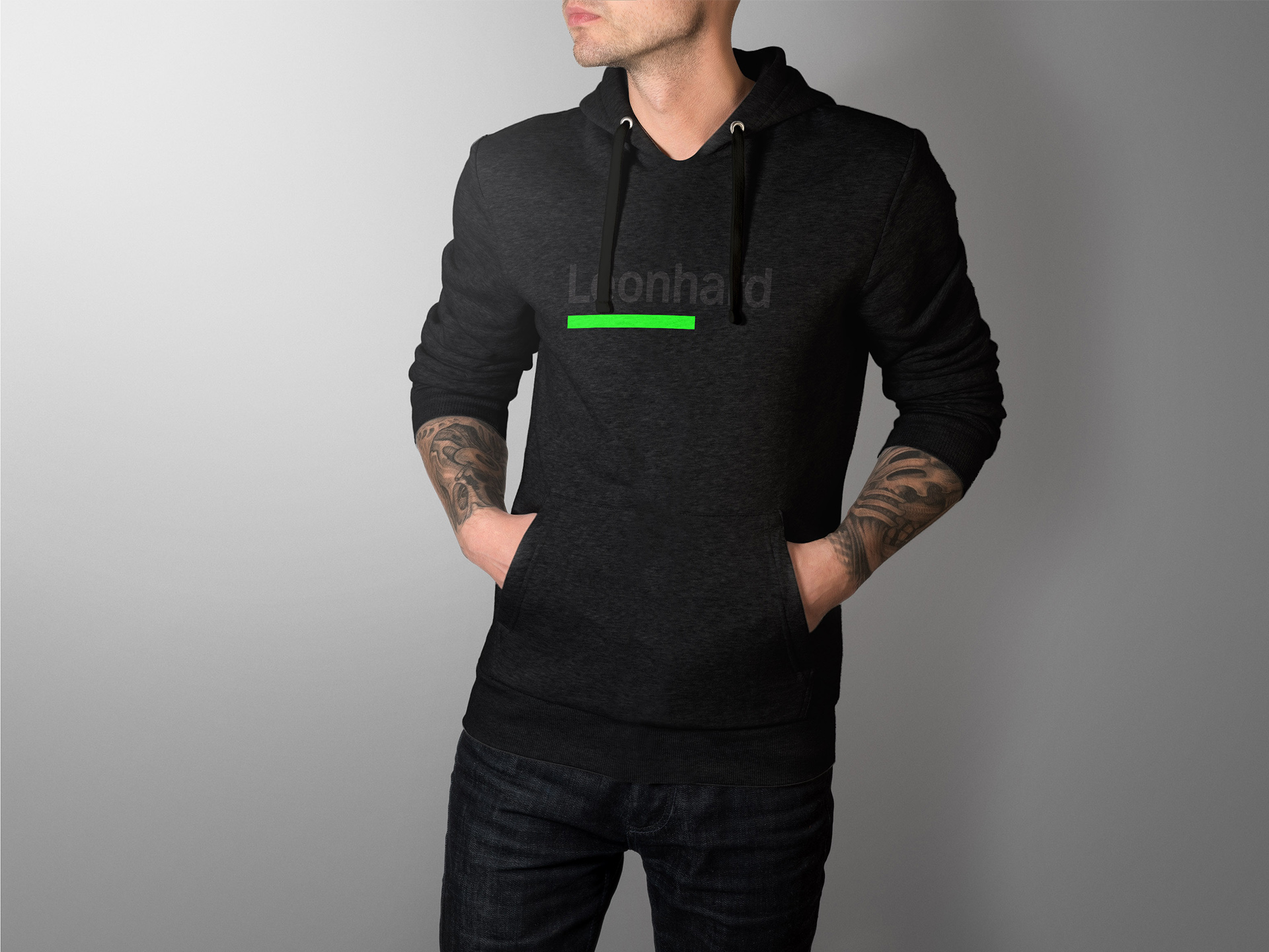
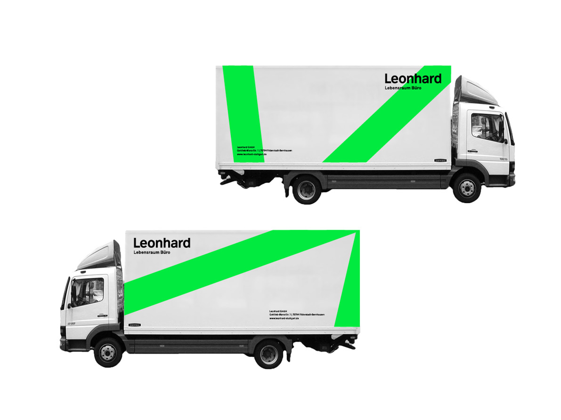
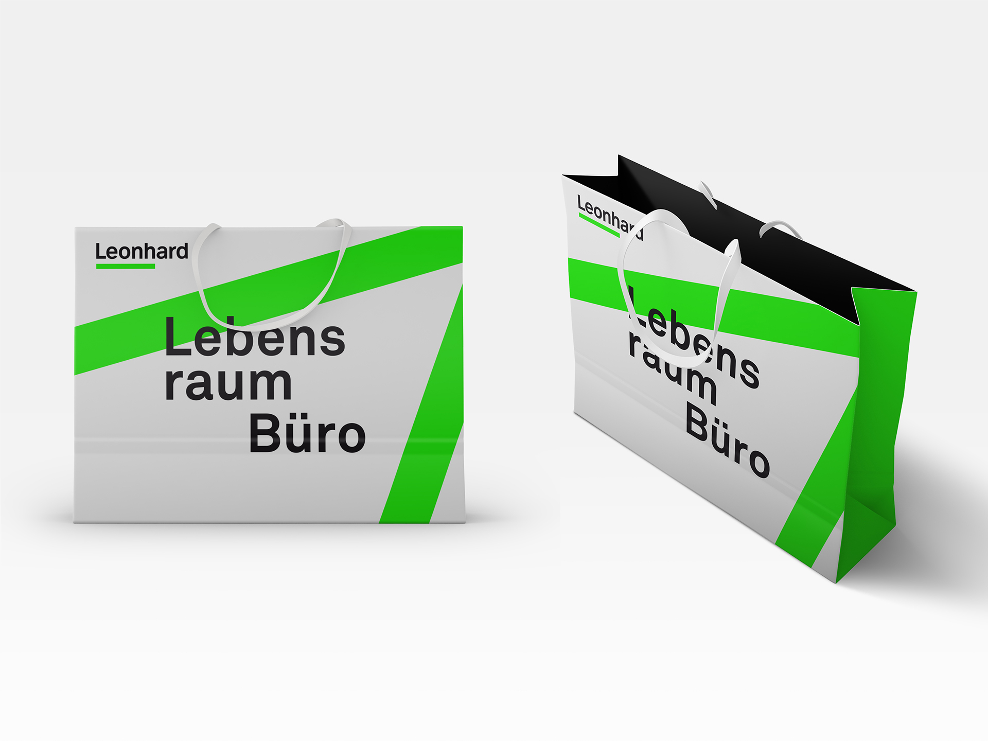
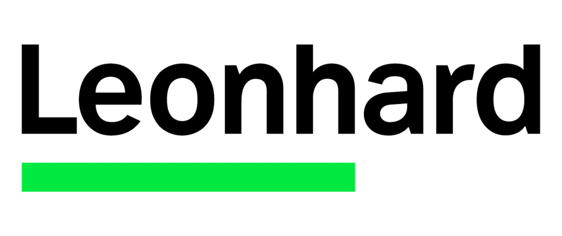
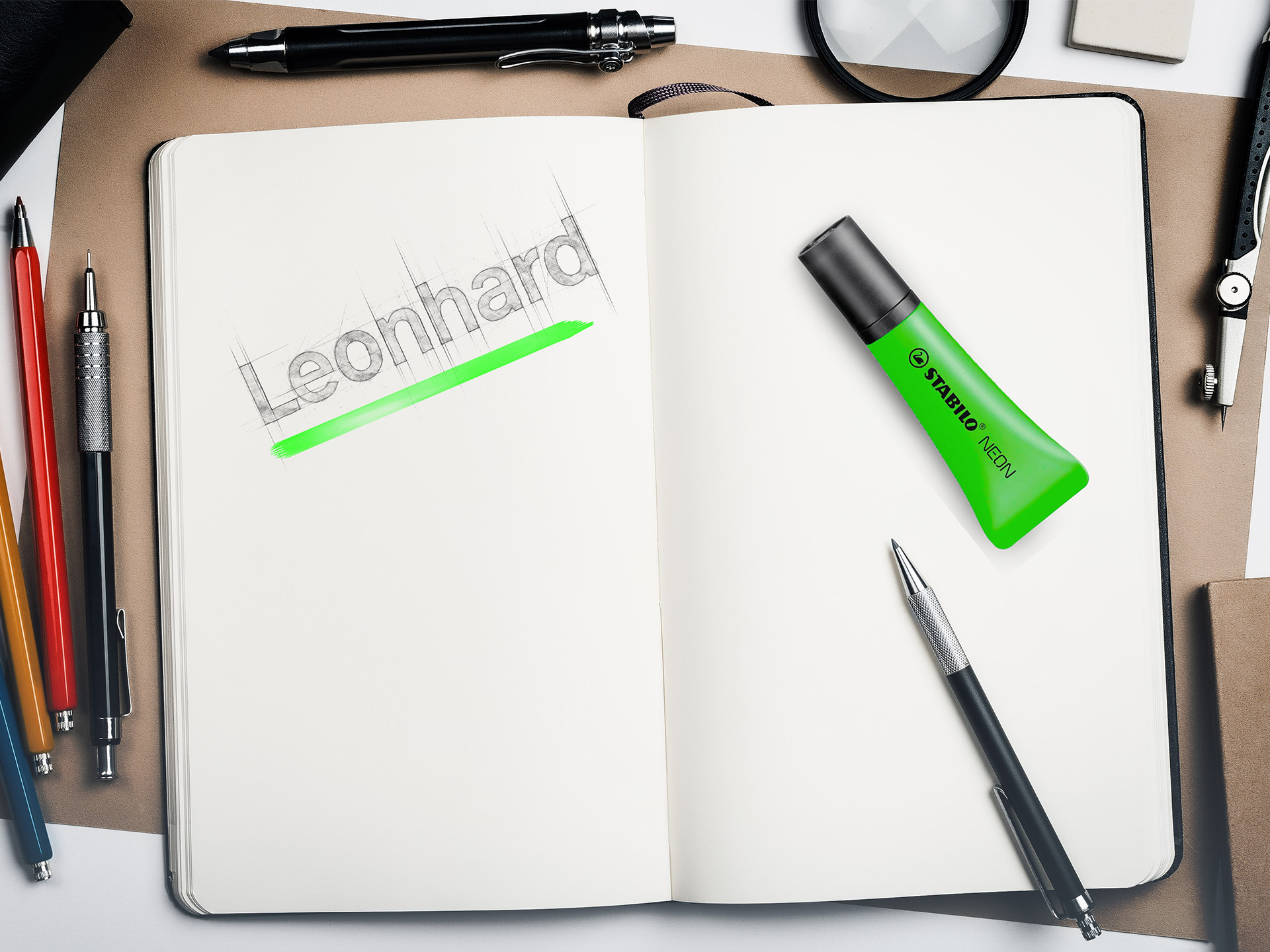
In the beginning there was a line. It was the neon green line of a highlighter pen, of that object that is sure to find itself at home in any office anywhere in the world. This was the inspiration that led the communications agency typenraum to design Leonhard’s new corporate identity, creating a new, modern, and timeless effect that now shapes the visual look and feel of the company. This idea of highlighting now runs as a thread through all the design work. The basis for the key visual is an extremely enlarged geodesical model, which appears in sections on many branded objects. Two logo variations were prepared for the office and property furnishing and design company from Filderstadt: one with the prominent neon green line and one with the slogan “office living environment”, which is applied everywhere, where there is a need to specify what the company is all about.
Multiple application options
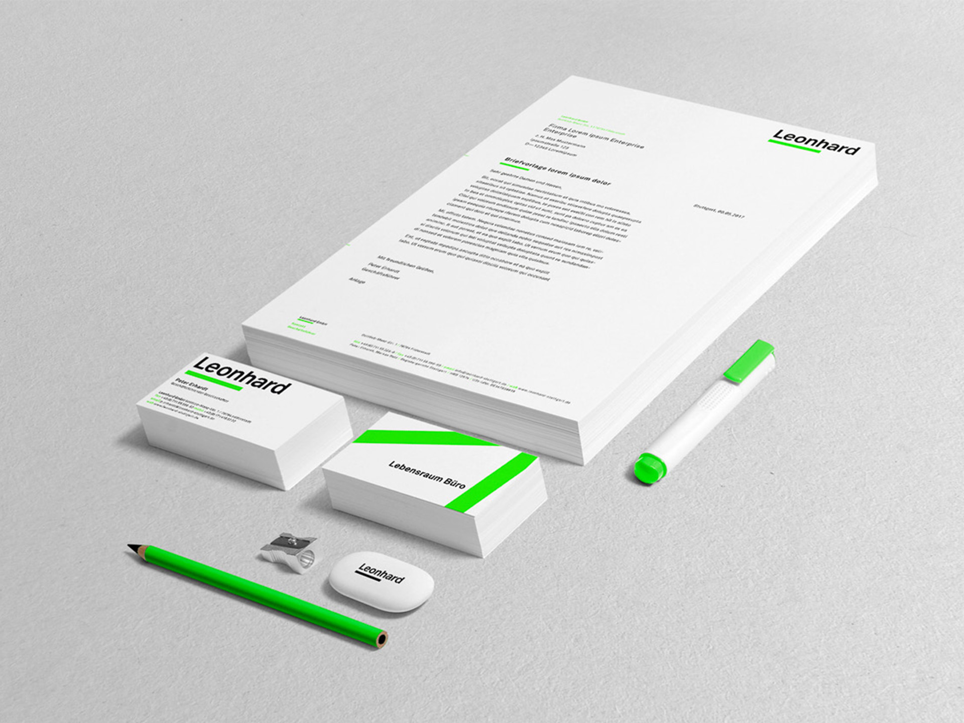
A range of specific corporate design applications could be derived from both variations of the company logo and from the key visual starting with classics from the stationery department and moving on to notebooks, image ads, bags, and packaging material all the way to different event decorations. Application examples extend from the branding of company vehicles and staff uniforms using the new Leonhard look up to employer branding.
Typenraum also developed the presentation template that Leohnard uses both internally and externally, for example, for client presentations. Typenraum designers also developed an event invitation designed to look like a boarding card, as it was for a Copenhagen architectural tour organized by Leonhard. The design of this invitation carries within it both the company’s corporate design and alludes to the art of travel, thereby seizing on the fact that the company is also located in the vicinity of the Stuttgart airport. Thus emerged — originating from the inspiration of a neon green text highlighter — a complete corporate design, which transports the Leonhard brand in multiple ways.