Corpoprate Design — 2017 — Sportler AG, Bozen
Corporate Identity
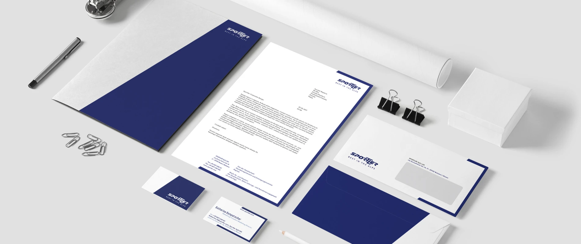
For 40 years, Sportler AG in Bozen has scored big as the leading sporting goods retailer. Sportler’s main themes – dynamics and movement – were picked up in the new corporate design: The dominant image is a steeply sloping line that brings in everything from office equipment to image advertisements, from catalogue layouts to retail outfitting.
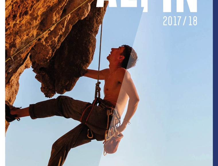
For the sports retailer from South Tyrol, typenraum developed a comprehensive and dynamic corporate design of which the foundation and common thread throughout text and image consist of a 16-degree angle, derived from a refreshed version of the Sportler logo. The logo refinement took place on sub-brand logotypes such as Bike, Alpin, Rent, as well as online. Additionally, in connection with these changes, the brand colors were also refreshed, becoming more persuasive through harmonious contrasts.
Verstatile angle
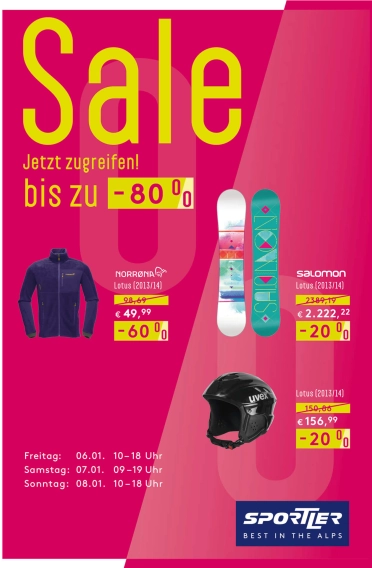
With regard to the logo symbol, the angle, or, rather, the resulting diagonal, leaves a lasting impression: it shapes the brand’s visual appearance and serves as a primary characteristic for brand recognition, both on- and offline. Even a percentage sign used as part of a campaign can be optically connected to the Sportler logo through the use of the diagonal.
Together with the frames and their corresponding colors, the diagonal becomes a key visual for Sportler. Through this connection, the Sportler brand is transported and, at the same time, is always recognizable, whether for a sales campaign or, for example, for the product offerings from one of the sub-brands such as Bike or Alpin.
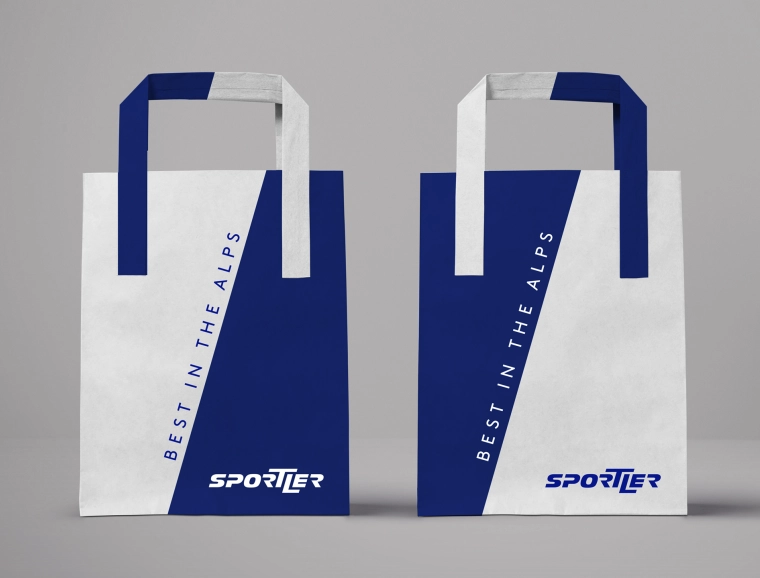
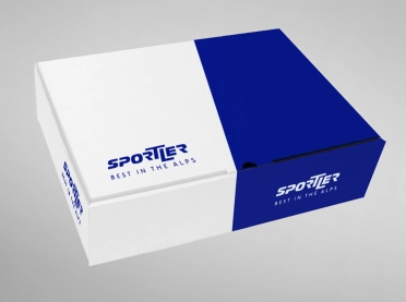
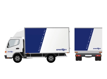
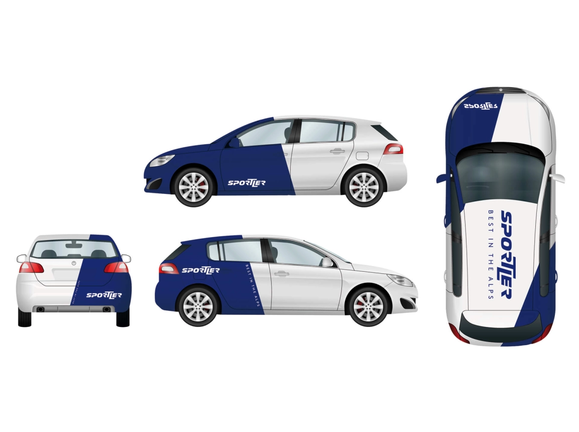
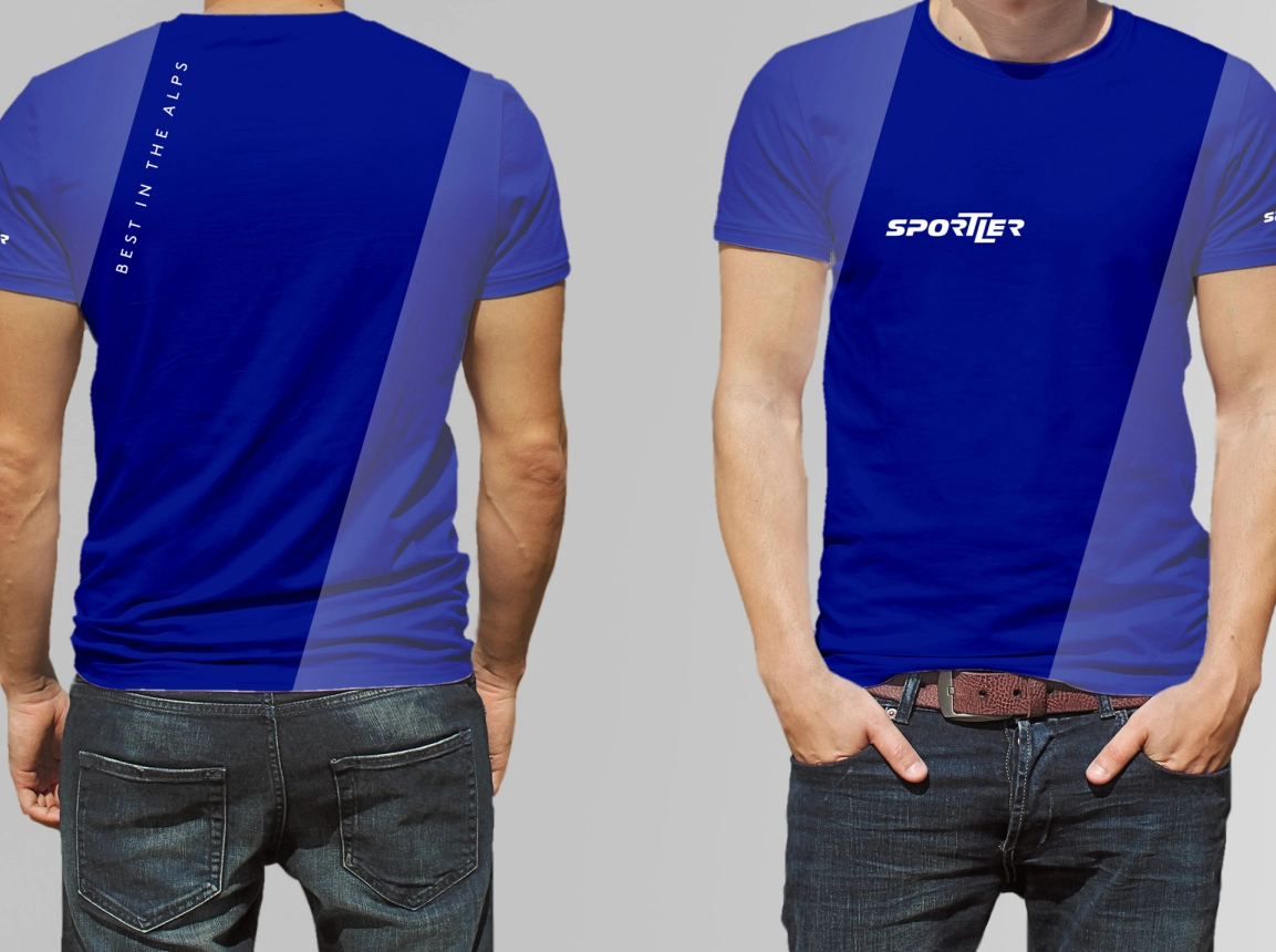
In addition to the classic design applications, the new corporate design offers a broad palette of applications. Whether seen on social media or online, on backlit billboards, loyalty cards, event invitations, bags, or in a window display, the Sportler brand is immediately recognizable. This also applies to apparel, as well as to the company fleet, which have equally been branded with the new design.
