Monobrand concept for a nature fashion brand, design and realisation — Kaiserstrasse 3, 60311 Frankfurt am Main, Germany — 200 m² — 2013 — Hess Natur-Textilien GmbH
Nature is more than just a word
Terms like „environmentalism" or „ecological responsibility" have reached the centre of society long since. Thanks to pioneers like hessnatur which has paved the way for sustainable products since its foundation in 1976 – long before sustainability debates dominated the political and societal agenda.
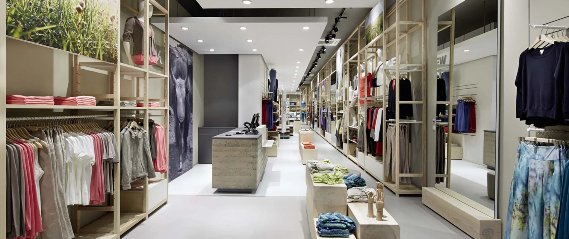
Now again, the nature fashion brand and the designers of blocher shops turn out to be forerunners and connect ecological responsibility with modern aesthetics. The interior designers from Stuttgart have perfectly translated the values of the company into the store: wood, bright beige walls and white metal define the shop aura which emphasizes the high-quality goods and sustainability messages thanks to its reduced design. The planers took advantage of the long and narrow layout of the heritage-protected building to guide the customers on their journey trough the world of hessnatur. It begins at the entrance where ash wood furniture vividly depicts the nature theme. Followed by a ceiling-high, 17 metres long shelf, accentuated by graphics of forests and nature. Accompanied by reduced furniture like the mirror set in a wood block, the customer gets to the home department in the rear area. Here, a large bed as well as a bath tube, placed on ornamental tiles, make for special merchandising islands. The fitting rooms are places of inspiration for the customers. They radiate clarity and warmth thanks to their wooden panelling, beige curtains and backlit mirrors that radiate a soft light.
For hessnatur nature is more than just a word. The new store concepts commits to ecological sustainability with every fibre. The materials match the strong guidelines of the company. Plastic is taboo. Instead, all materials originate from sustainable, regional cultivation and can be recycled. This is the requisite for authentically staging the brand. Which becomes especially evident in the so-called hessnatur world. The heart of the store stands out with its suspended white panel under the otherwise dark ceiling. The checkout counter: a cube made of rammed clay whose layers tell from its origin in different regions. According to the cradle-to-cradle principle it simply can be returned to the soil. The stools in the lounge do also have their own story: they were assembled from shopfitting leftovers like felt or newspapers. Thereby the furniture corresponds to a maxim which also underlies the collections of hessnatur: all production stages must be transparent and easily comprehensible. An arrangement of wooden lamellas makes informations and stories of the brand and its products tangible. Next to it the virtual pendant: a large world map where the individual production stages are shown on monitors. Where does the cotton for hessnatur come from? How examplary are the procudition conditions abroad? Here, the customers learn more. As they do at the touchscreen terminal (of course with an integrated wooden keyboard) and the tablet station where products can be sought in interactive catalogues and then ordered home. Additionally, an smartphone app allows in future to directly interact with the merchandise via augmented reality - to learn more about the products and their components. This is how the customers are addressed via all channels and how the world of naturhess becomes understandable and tangible.
