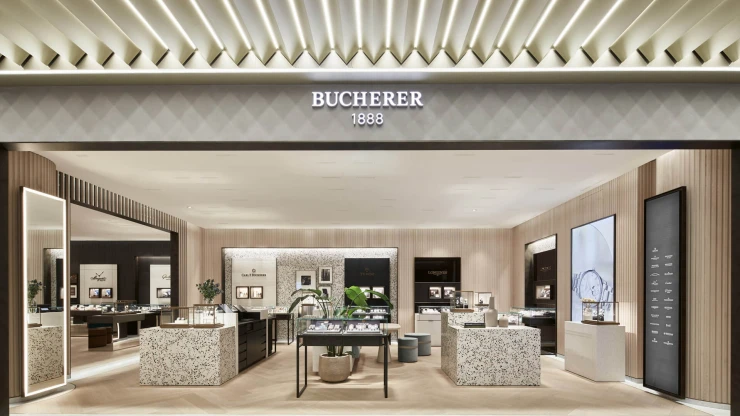
Planning and designing a luxury watch and jewellery store — Bahnhofstraße 50, 8001 Zurich, Switzerland— 1,068 m² — 05.2019 — Bucherer AG, Lucerne
Cast from one mould
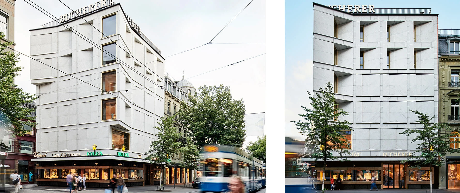
The flagship store of this renowned Swiss watch and jewellery retailer enjoys a prime location on Zurich's world-famous Bahnhofstrasse. Now, Bucherer has received a makeover, with a new façade. But the interior, too, needed to be redone. And this is where blocher partners came in.
A challenge facing the interior designers was the layout of the sales floors: They extend into the first floor above ground in the neighbouring building, whose playful, historic façade contrasts with the striking, modern exterior of the Bucherer House.
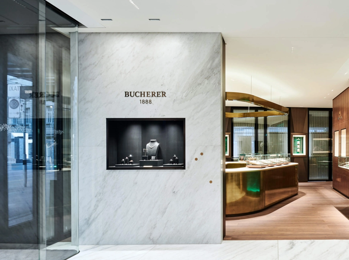
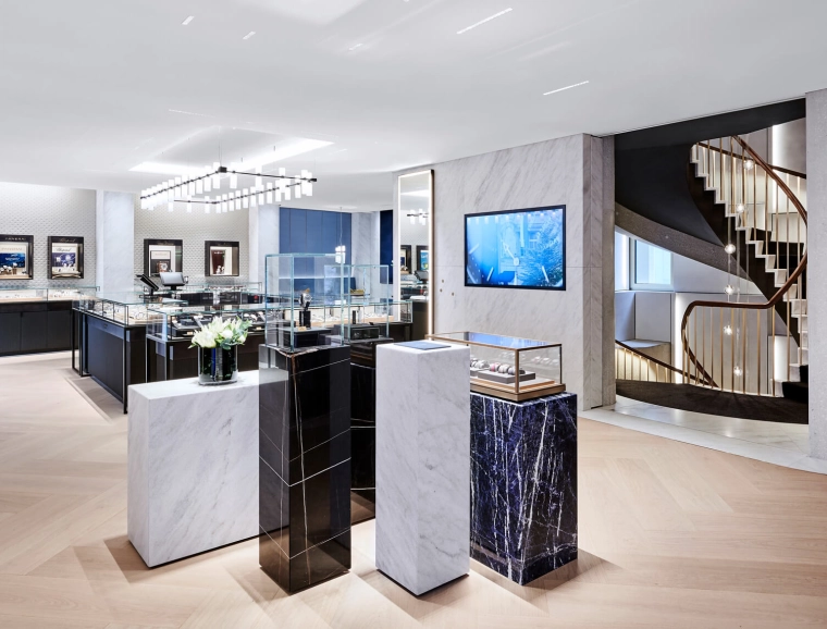
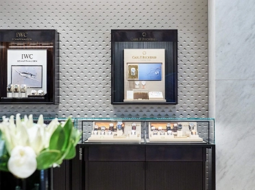
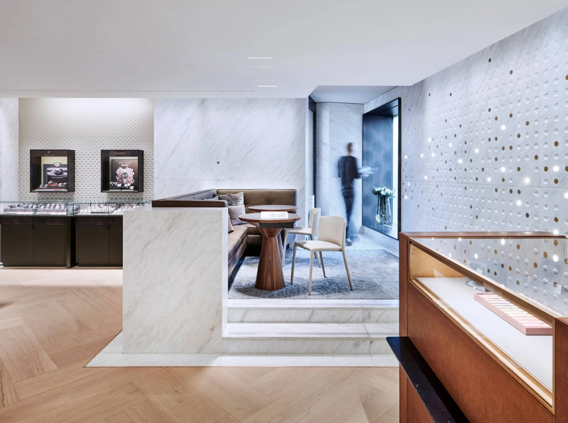
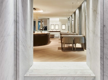
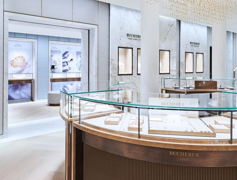
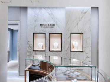
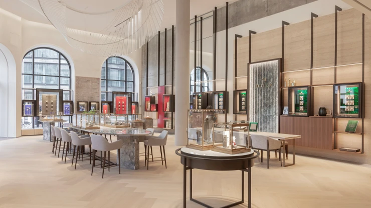
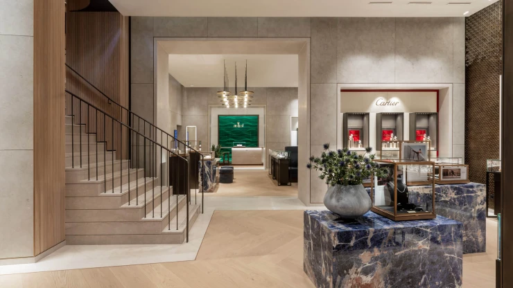
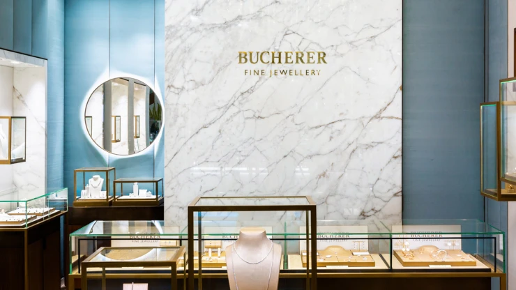
The design concept is based on a close connection between architecture and interior design. To that end, the pattern of the façade is reflected in the interior. Even the material used on the outside – Cristallina, the only marble quarried in Switzerland – is picked up inside: on the walls, in polished form, and on the floors as a frieze. And the metal colours used in the display window area made their way into the store, resulting in a high-quality and classic atmosphere as if cast from one mould.
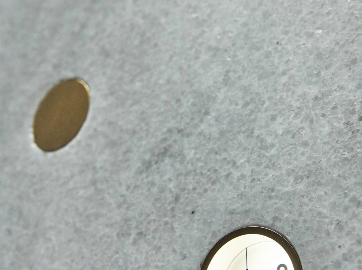
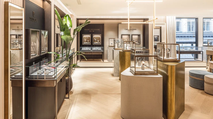
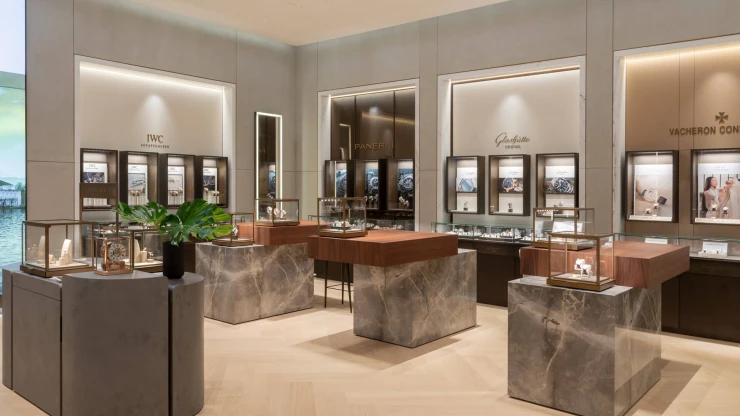
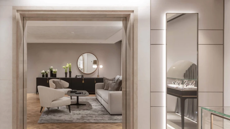
It’s not about design as an end in itself; rather, it’s about creating a striking and precise design language that works as a setting for Bucherer's watch range: on the ground floor with a Rolex boutique, on the first floor upstairs with additional brands – all of which clients can try on in the velvet-covered watch lounge. On the second upper storey is a watch service department, whose design highlight is the Cristallina marble watch display wall. The wall’s round recesses – some with hammered surfaces, others polished or fitted with metal plaques or with cast-in clock parts – are a tribute to the Swiss art of watchmaking.
Elegant worlds of jewellery
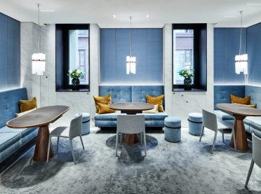
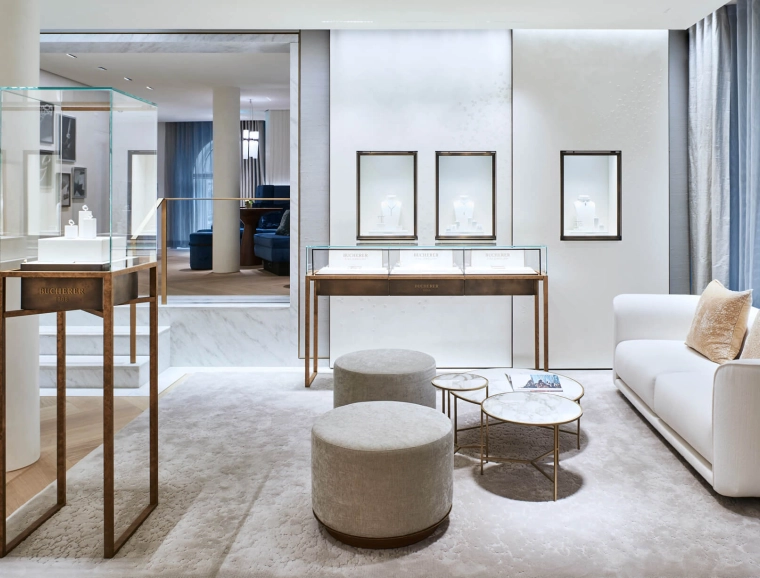
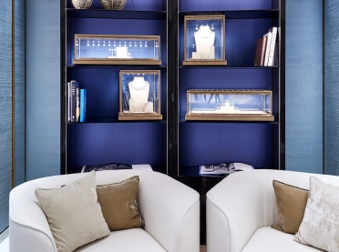
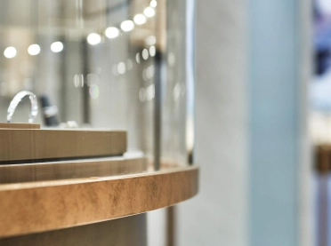
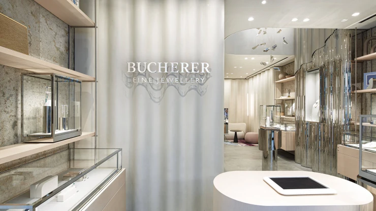
The first floor above ground in the neighbouring building – connected to the flagship store via a passageway – houses the jewellery and romance department. Here, the design language picks up on the façade of the building itself: it’s more playful, softer. Jewellery is displayed on oval counters with special lighting; a separate, private area done in blue silk and a café area likewise decorated in blue velvet tones feature semi-circular niches for consultation and trying on fine jewellery.
In the final analysis, the designers created a new and modern flagship store with an exterior and interior that complement one another; and they created spaces where Bucherer's luxury wares are perfectly displayed.
