Conversion and modernization of a fashion house — Lange Straße 80, 26122 Oldenburg, Germany — 16,500 m² — 03.2023 — Leffers & Co. GmbH & Co KG, Oldenburg
New elegant look
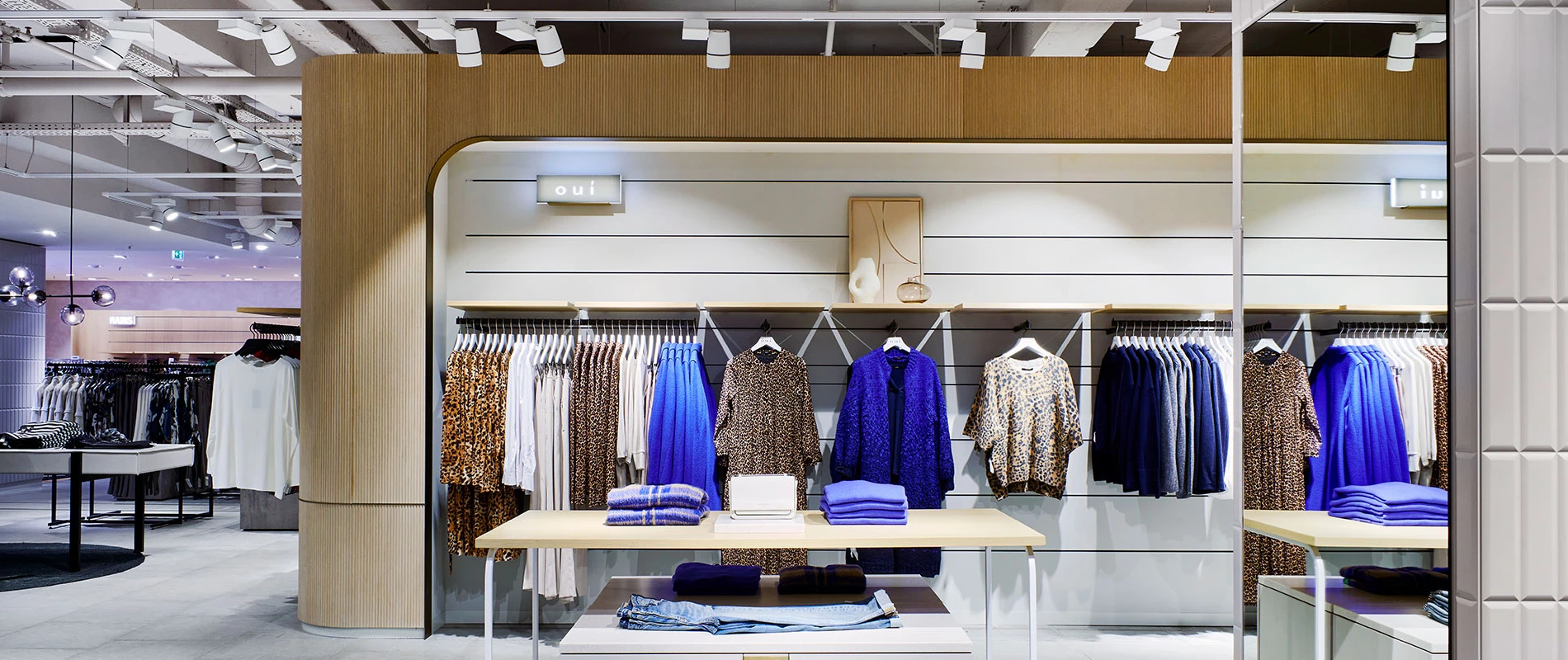
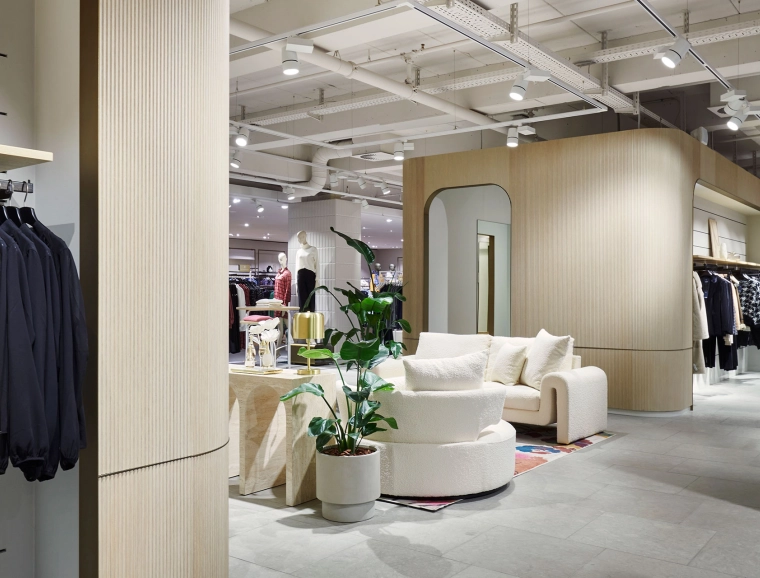
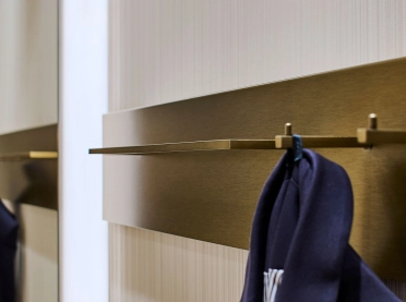
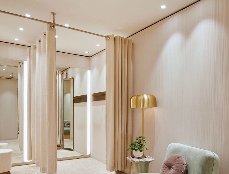
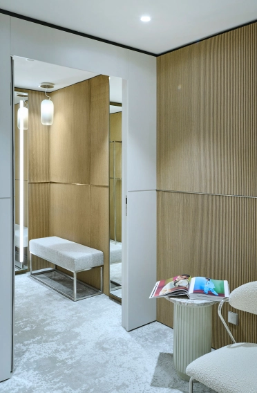
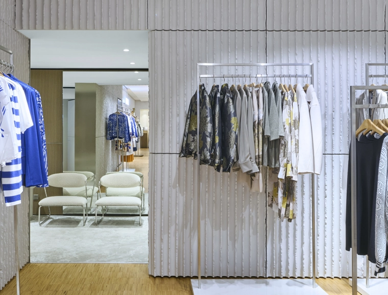
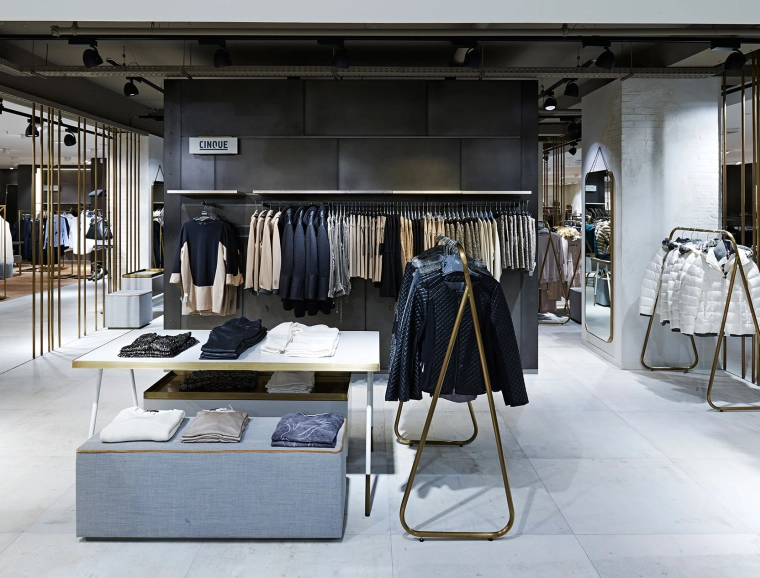
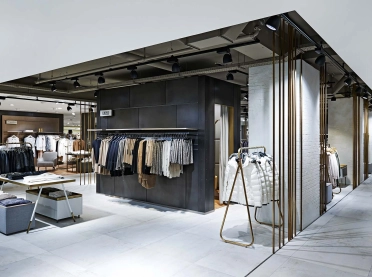
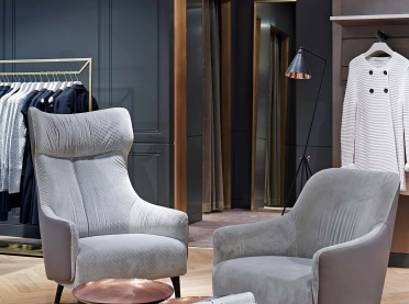
With the redesign, the interior designers have given the women's department on the first floor a new, elegant look. Delicate nude tones characterize the atmosphere, paired with natural materials and a variety of textures.
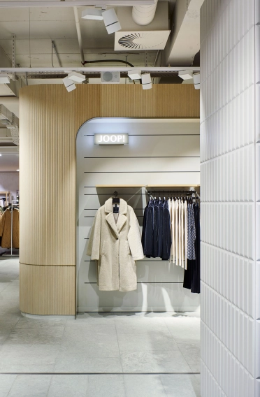
Circumferential rear walls with a fine spatula finish in light nude tones create a visual bracket. In combination with indirectly illuminated wooden niches made of light oak, a harmonious setting is created that puts fashion centre stage.
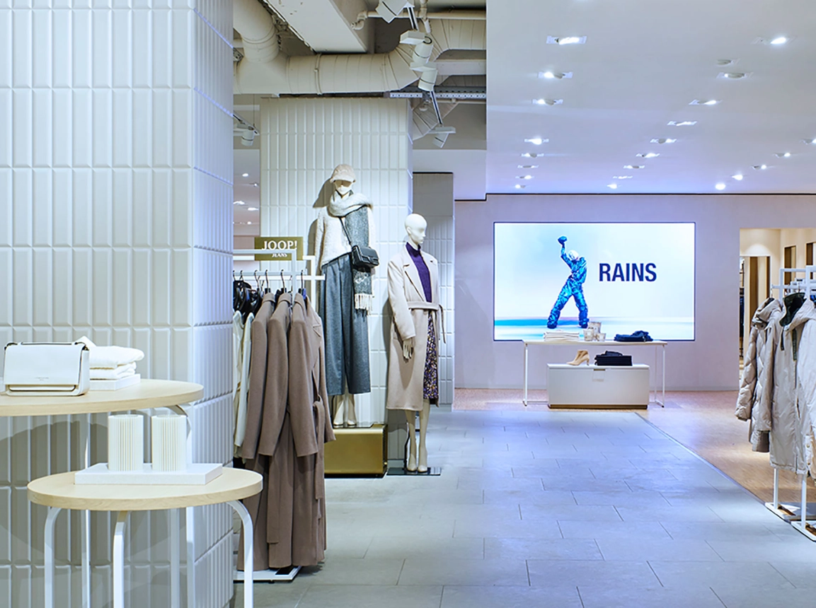
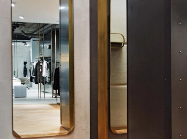
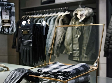
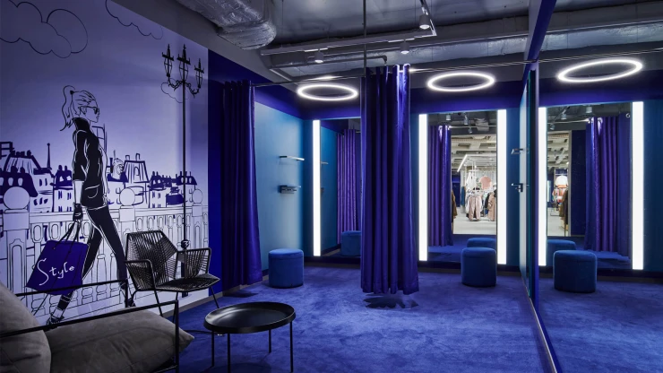
Round shapes emphasise the femininity of the department: two central cubicle blocks are clad with whitewashed oak slats; they form the heart of the room. Entrances designed with round arches, minimalist furnishings and natural materials emphasise the feeling of subtle elegance. The centre furniture echoes the feminine shapes, while the supporting pillars are clad in a high-quality 3D tile look. Semi-transparent centre panels with a filigree expanded metal look in brass lend the room a sense of lightness. A spacious, flexible VIP cabin provides space for special shopping moments. The area for special occasion clothing stands out clearly from the rest of the space thanks to a new, light-coloured herringbone parquet floor, which is edged with a brass pilaster strip.
Combined with digital elements such as an LED wall and individual screens on the support pillars, the result is a cool, metropolitan department that combines sophisticated design with subtle nuances to create an inviting and inspiring environment for discerning customers.
Striking accents for modern brand staging
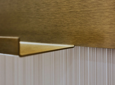
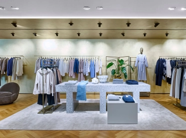
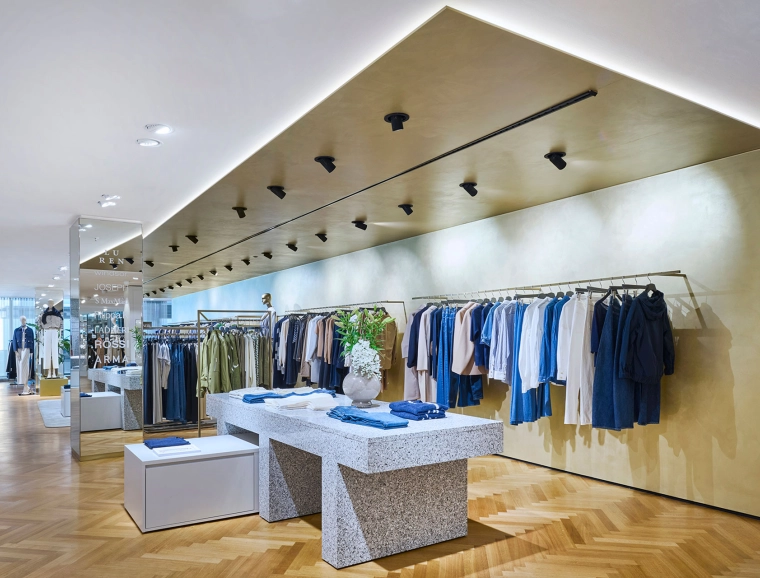
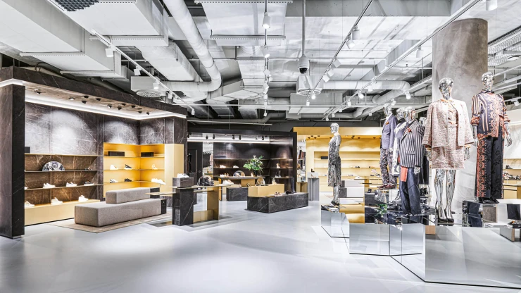
When the new premium department opens in August 2024, the second floor of will have a high-quality, modern look. A particular highlight is a striking brass angle that extends from the wall to the ceiling, emphasizing the length of the room.
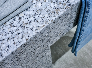
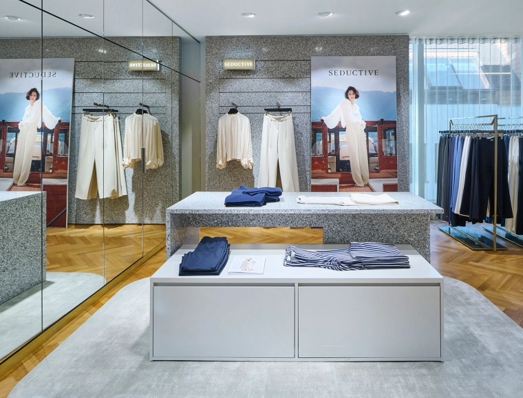
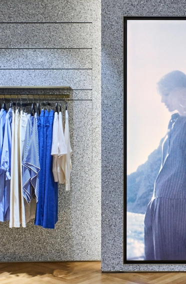
On the opposite side, terrazzo merchandise walls zone the space, broken up by the natural light from the generous glass façade. Storage areas and columns are clad with mirrors, making them blend discreetly into the background. A new space was created for Marc Cain adjacent to the women's wear department, which will be completed in 2023.
An oasis of beauty
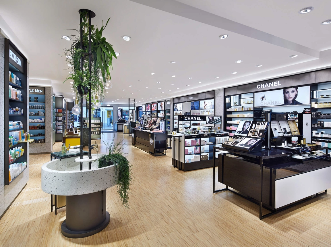
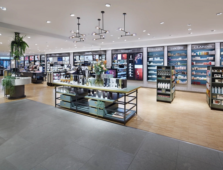
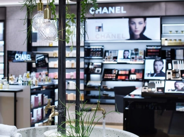
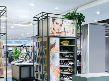
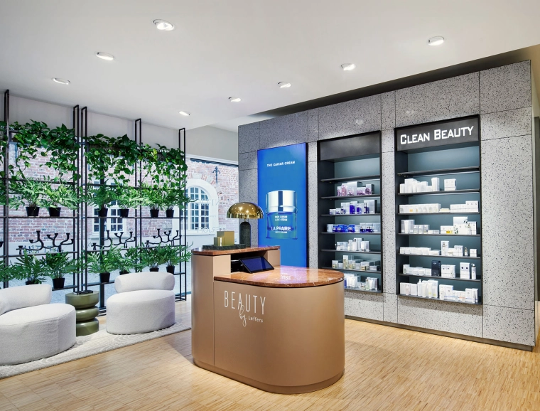
The biggest fashion house of the region just increased its attraction with the opening of the new beauty department in March 2018. Approximately 220 square meters offer perfumes, decorative cosmetics and care products for women and men. In the conception of the multi-brand and shop in shop areas, planners focussed on an exclusive and unique presentation of the goods while creating diverse thematic spaces where encounters between clients and customers are made possible.
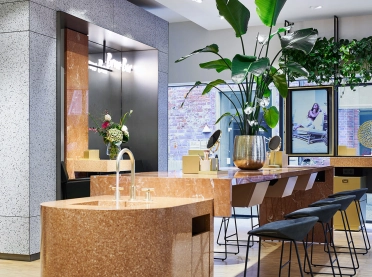
A perfume bar, a make-up table, a care products bar and a fountain are places of communication being perfectly adaptable to the self-image of Leffers, a family-run company with large tradition. Since 2005, blocher partners has been collaborating with Leffers, amongst others: Leffers gastronomy.
The sales area houses exciting proportions – with a relatively long layout containing a transition to the rest of the fashion house – and the interior designers know how to use them.
An orbital light ledge, inspired by the historical building facade gives the room a wider appearance and the use of fabric panels respectively terrazzo surfaces in the design of the wall creates more clarity and further zoning.
Diverse contrasts
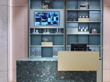
While designing the shelves and centre furniture, the shapers used a form and material mix that can combine traditional and modern elements, thus creating contrast: Black crude steel shelves with drawers in the style of a pharmacist’s cabinet and brass accents. Flexibly usable furniture with luxurious green marble surfaces. The existing floor consists of light industrial parquet;
Some walls offer fabric panels, some others terrazzo tiles that reflect the colour of the used marble in their sprinklings. A further highlight is the design of the shop in shop areas and the care products: Here, the niches were used to present the goods, thus framing the single shops. A consistent logo line creates more clarity.
An area that enables encounters
The core of the thematic spaces in the department of body care is the fountain. It creates a small, green oasis that includes a terrazzo basin, brass-made water taps as well as exposed water pipes. The opening day demonstrated that this composition of the room can impress: One customer commented the new department with the words: “This is just like Paris!”
New shoe world
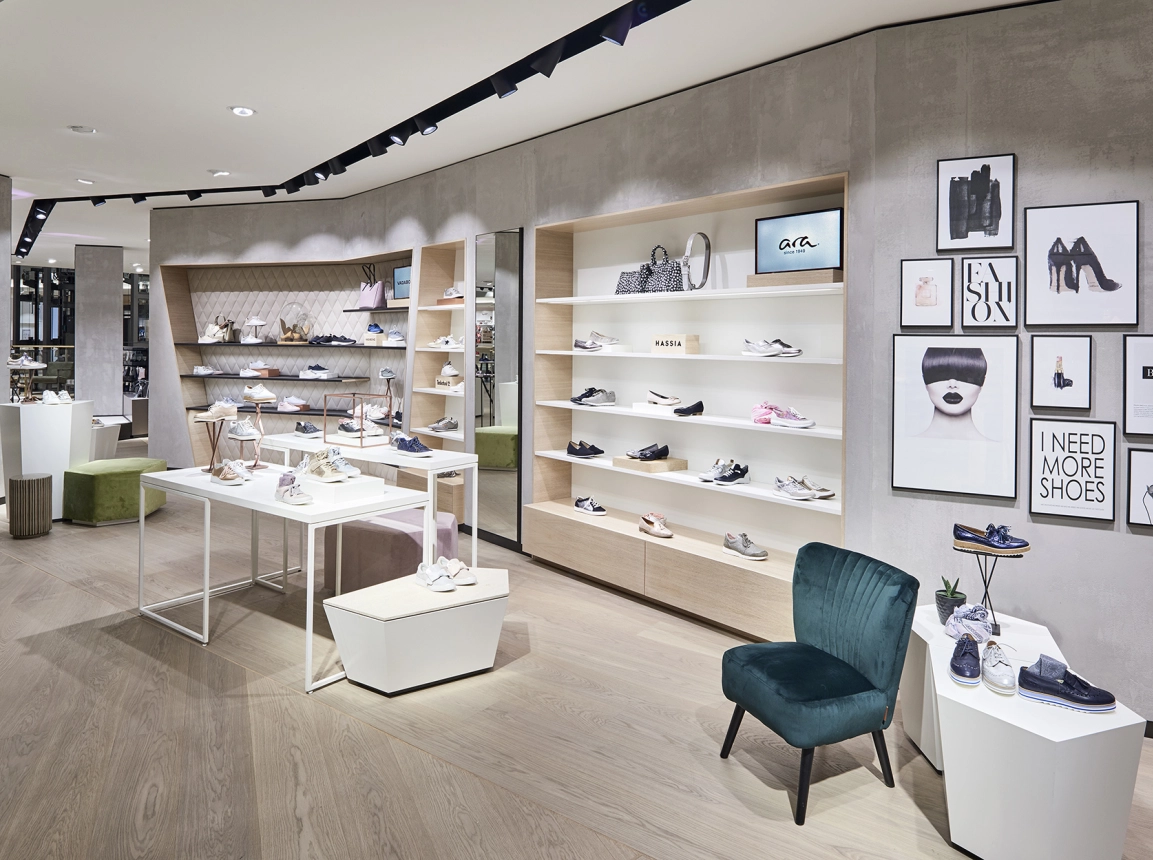
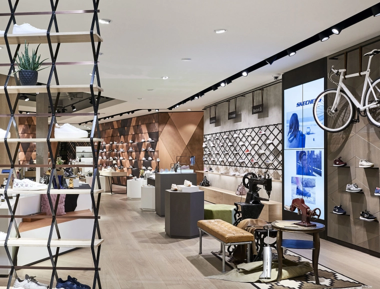
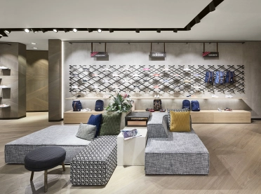
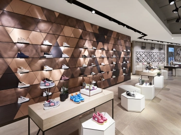
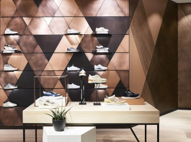
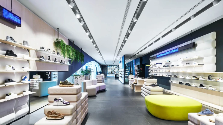
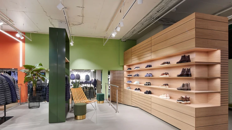
blocher partners interior designers have created a new women's shoe department on the third floor of Leffers fashion house. With its dynamic spatial structure – as part of the store’s fashion world for women – the department invites you to stroll through three thematic zones: The Premium World offers upscale shoes in a correspondingly classy ambiance; Casual Style features informal, comfortable shoes in a setting marked by natural materials like oak; and sneakers are strutted out in an urban atmosphere, on steel shelving against concrete walls.
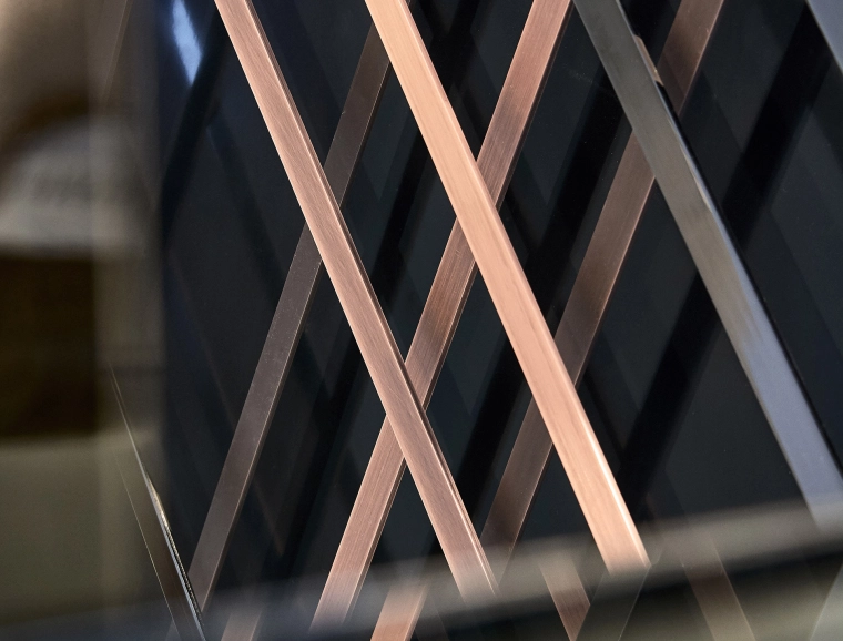
The interior architects used semi-transparent space dividers and specially designed highlight surfaces to realize a new structure and concept for the 500-square meter space. Attentively curated “islands” with seating, combining different materials like copper and steel with wood, concrete or unusual surfaces – including colour effect glass – generate “aha” moments, creating a world to discover.
A shoe experience
The interior designers chose the dynamic polygon as their guiding principle, integrating it into the floor plan layout, wall details and cubic mid-space furnishings. They integrated technological highlights, including a LED video wall, displays for checking availability, digital logos and cell phone charging stations into the plan. Which means the new shoe department can go way beyond the practical: It can also inspire and guide customers, even locate a matching outfit in the adjacent department. A shopping experience that revolves around the shoe.
Structuralism of spaces
Fashion is always in progress. Everything has already been there and still shows new facets again and again. Leffers in Oldenburg set itself to accompany this steady change supported by the planers of blocher partners who modernized and re-structured the sales spaces.
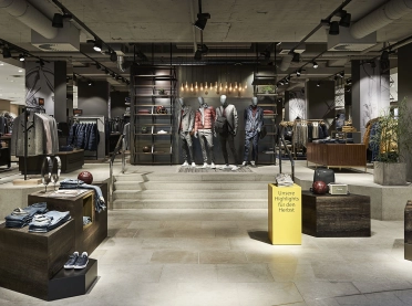
After the conversion, the house is brighter and clearly structured: to make the experience within the the spacious store more tangible and to ensure orientation, individual brand and theme worlds were created. Room-in-room elements organize the depth of the sales floor without obstructing it.
You get what you see
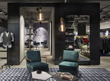
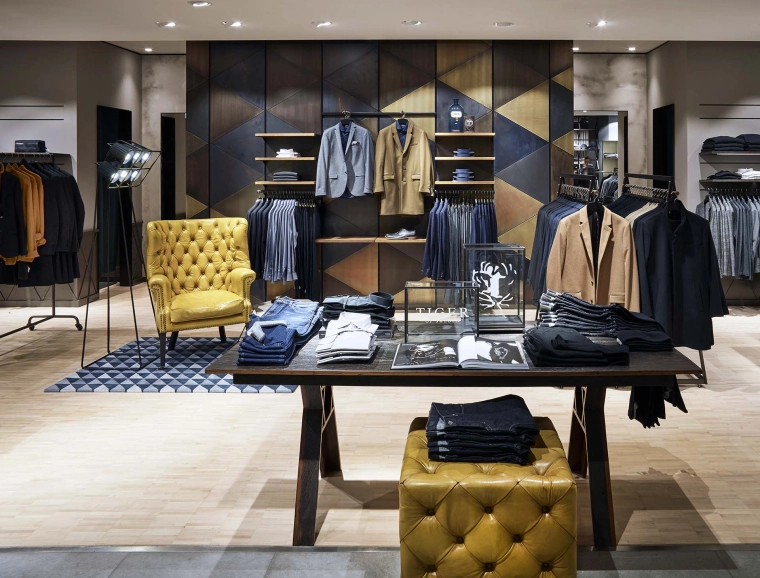
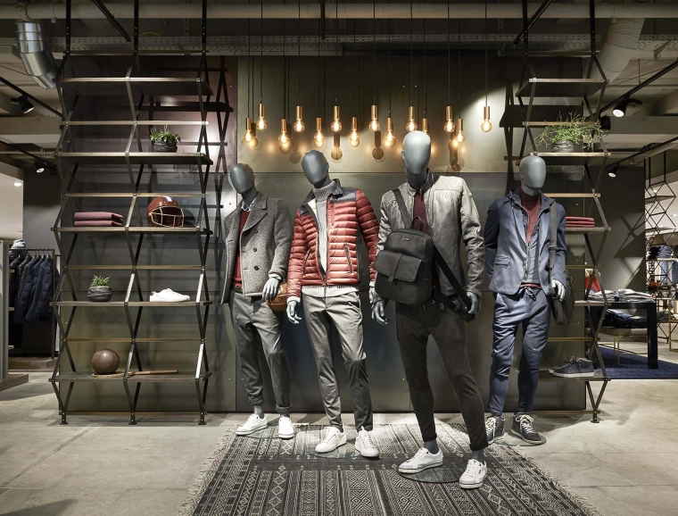
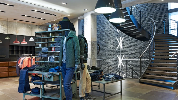
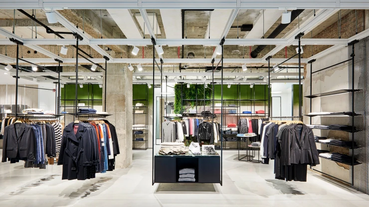
The renewed Leffers store is a prime example for a future-oriented conception what includes appealing assortments and services as much as an attractive store aura. For example in the men's department: here, the three theme worlds Casual, Urban und Suits do not just represent different fashion lines.
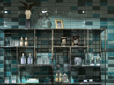
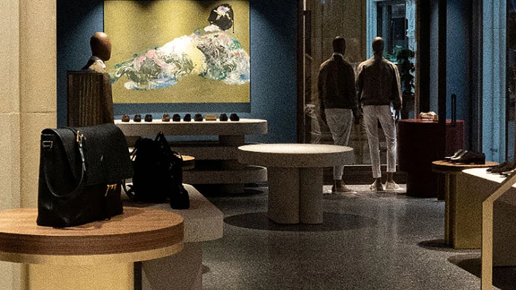
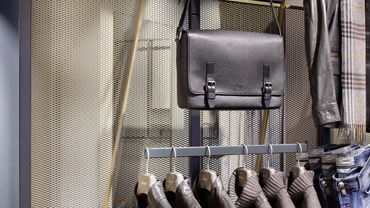
They are also an expression of the everyday realities of the modern man, moving among home, travel and work – characterized by concrete and brick, brass and leather, parquet flooring and wallpaper. As highlights, the interior designers have placed exhibition pieces like a motorcycle, shaving equipment and a gin bar in the space. These exhibited objects are also available for purchase. The restaurant on the first floor, with a bistro and a lounge area, pairs loft style with elegance and offers customers both classic dishes and modern fare throughout the shopping day, from breakfast to midday snacks to afternoon coffee.
