Corporate Design, orientation system — Dornierstraße 1+2, 73730, Esslingen, Germany — 2008 — Möbel Rieger GmbH & Co. KG
Sensually Appealing
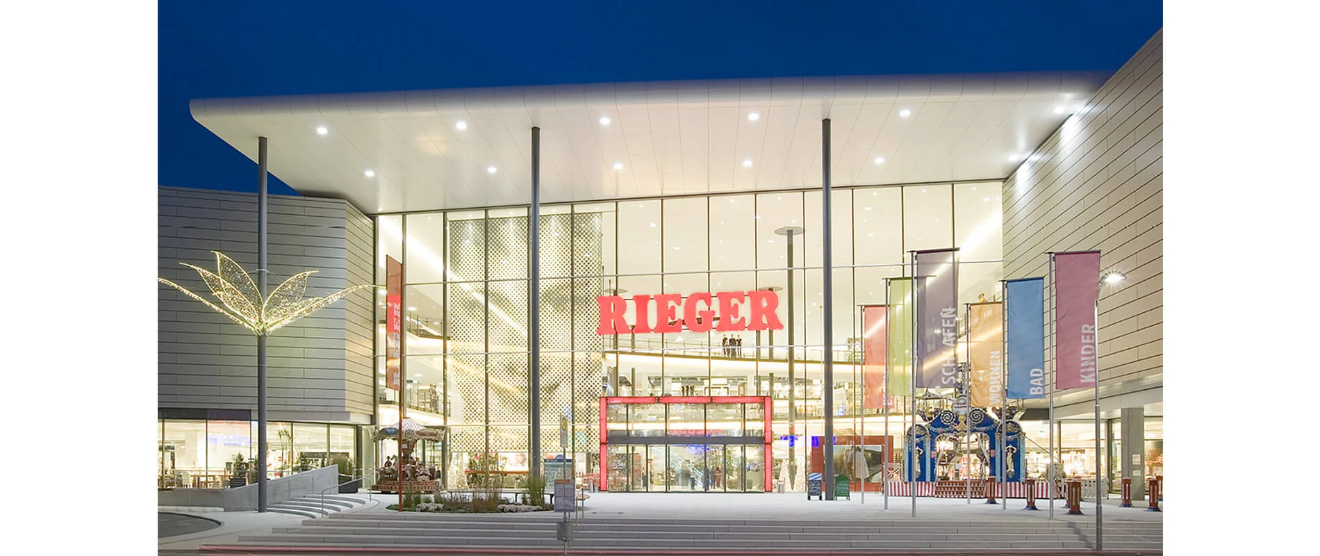
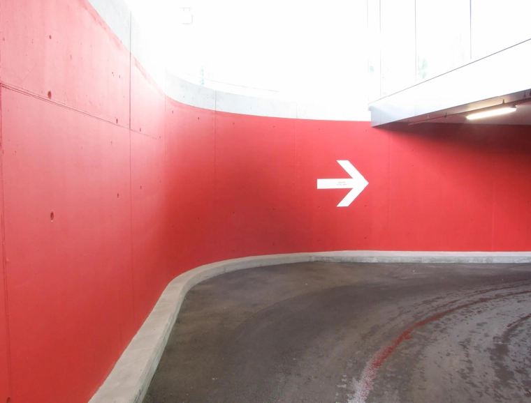
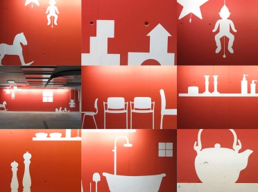
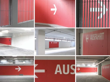
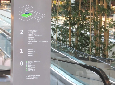
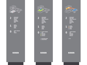
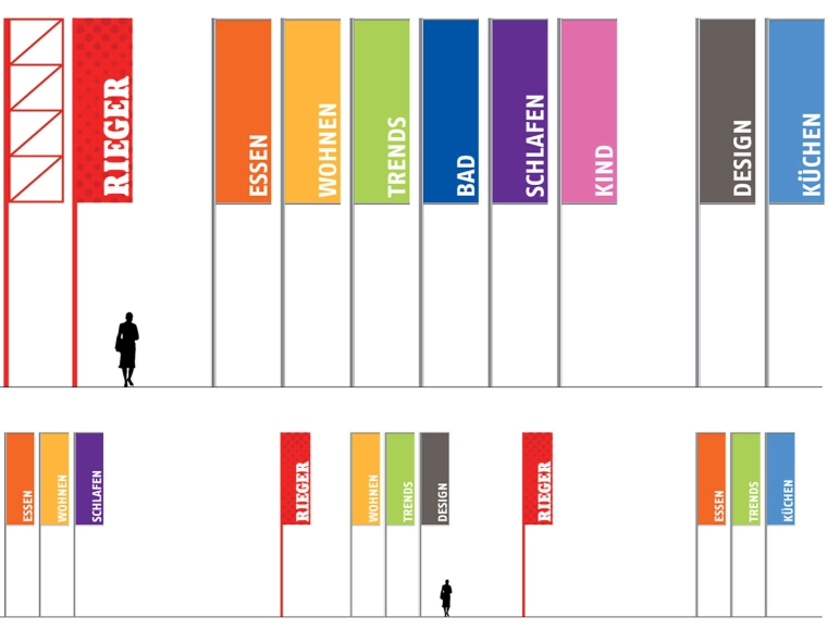
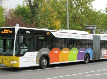
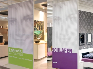
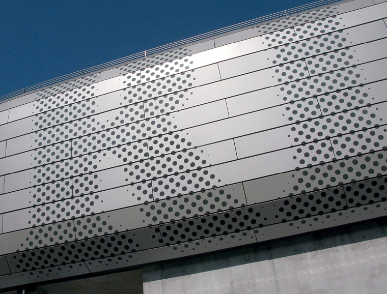
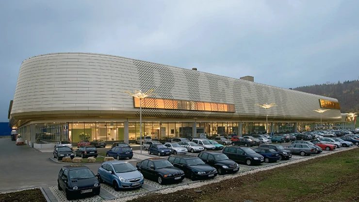
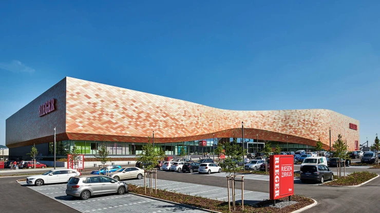
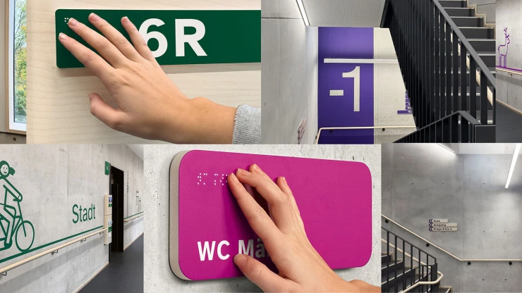
If there were a prize for the most spectacular furniture store, Furniture Rieger in Esslingen would be a hot contender. And not just because of its distinctive façade: The typenraum corporate design is right on the mark. A sensually appealing colour system eases orientation and makes it easy to find one's way among the different departments: living, eating, sleeping, trends, design and cuisine.
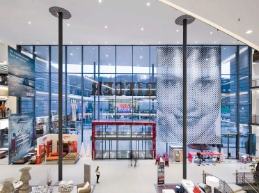
Large format banners in each department are visible from a distance. The "key visual" is the Rieger name in big letters standing out against the external grid façade, as well as on the lifts – in the form of "Anna Maria" which is part of the adorned plate. It was created for Rieger Welt, where a charming sales advisor picks up the visitor at the entrance and attends to his every needs. Since 2007, blocher partners has been collaborating with Rieger. Its accomplishments include the construction of a new furniture store in Heilbronn.
