Logo Development and Corporate Design, Guiding System, diverse implementations — Pohlweg 110, 33100 Paderborn, Germany — Klingenthal Südring GmbH
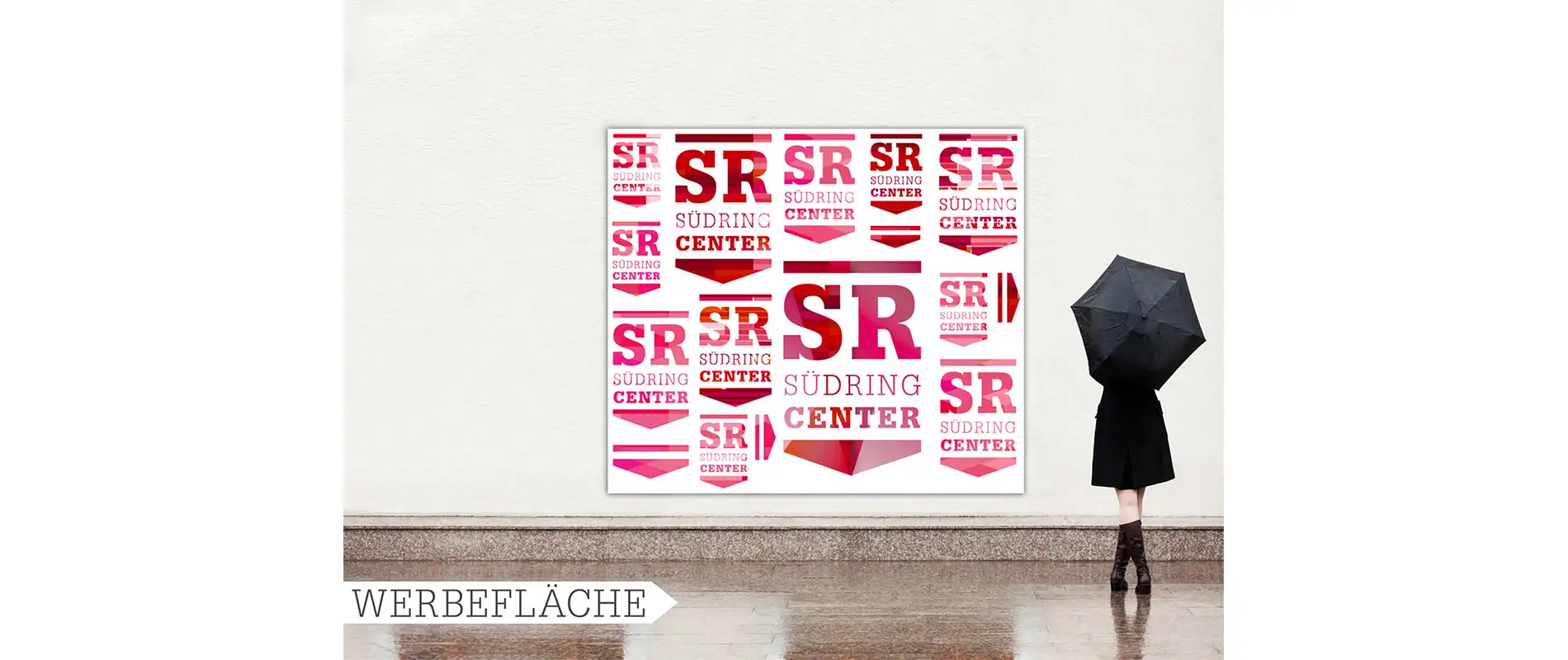
One logo – infinite possibilities
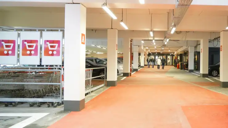
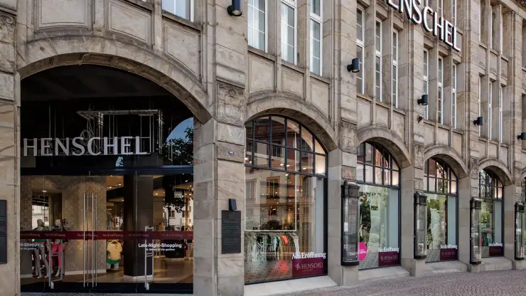
Convenient shopping, wellbeing, enjoyment. The Südring-Center Paderborn stands for the bright sides of life - since almost 50 years. Now, a new corporate design should breath new life into the brand appearance - accompanying the architectural restructuring. To stand out in a more and more competetive business. The new design is young, fresh, attractive. Since 2001, blocher partners and typenraum collaborated with Klingenthal Südring GmbH on projects like the implementation of a wayfinding system for the new parking garage.
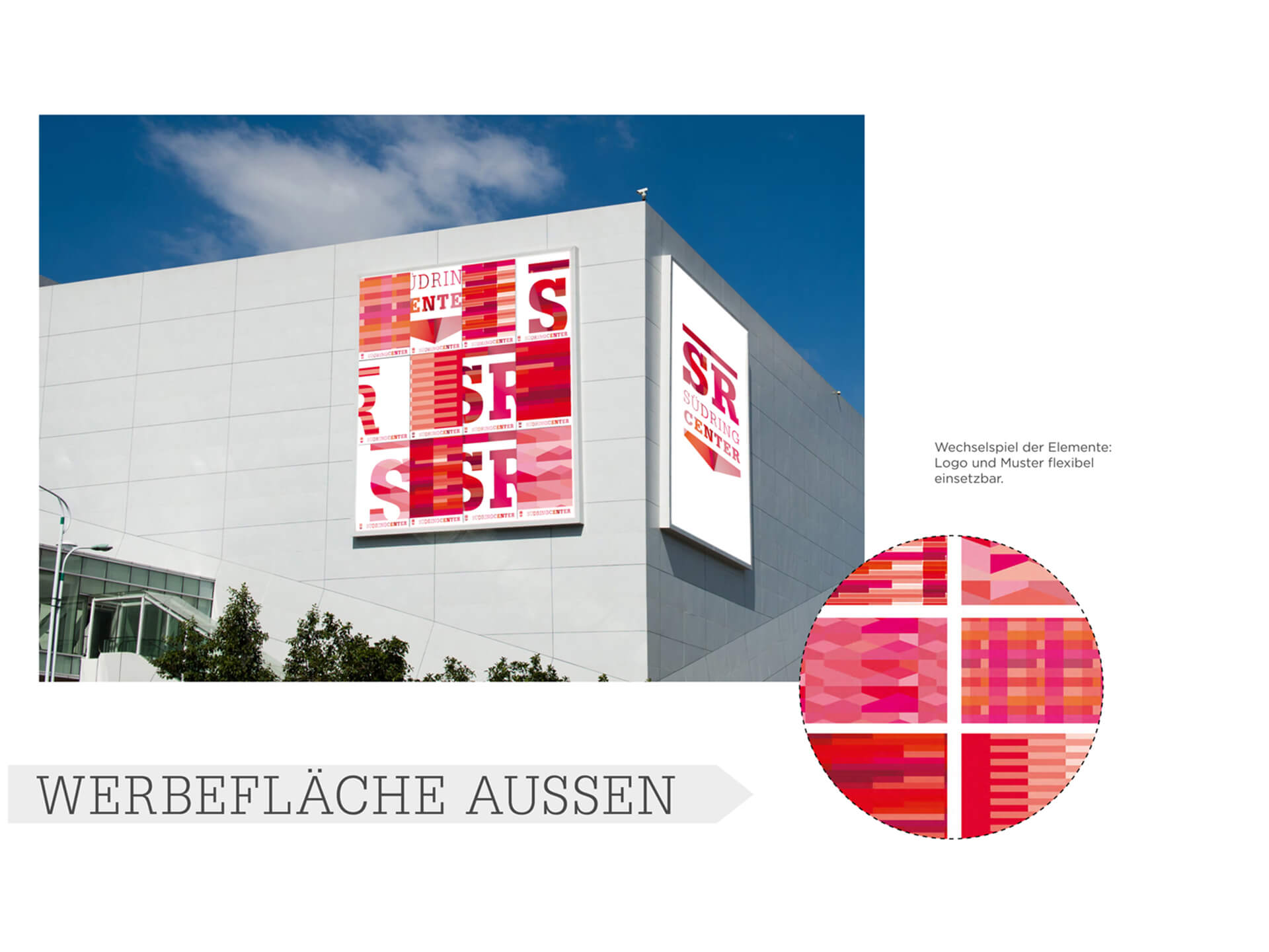
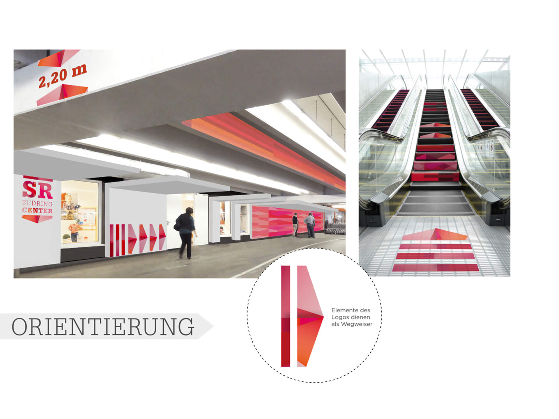
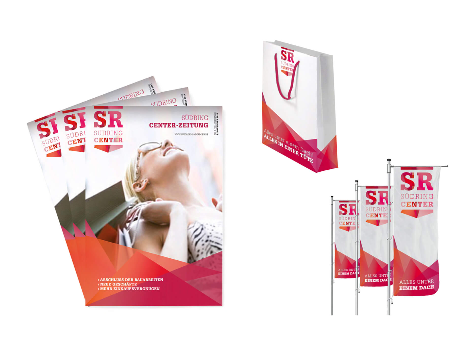
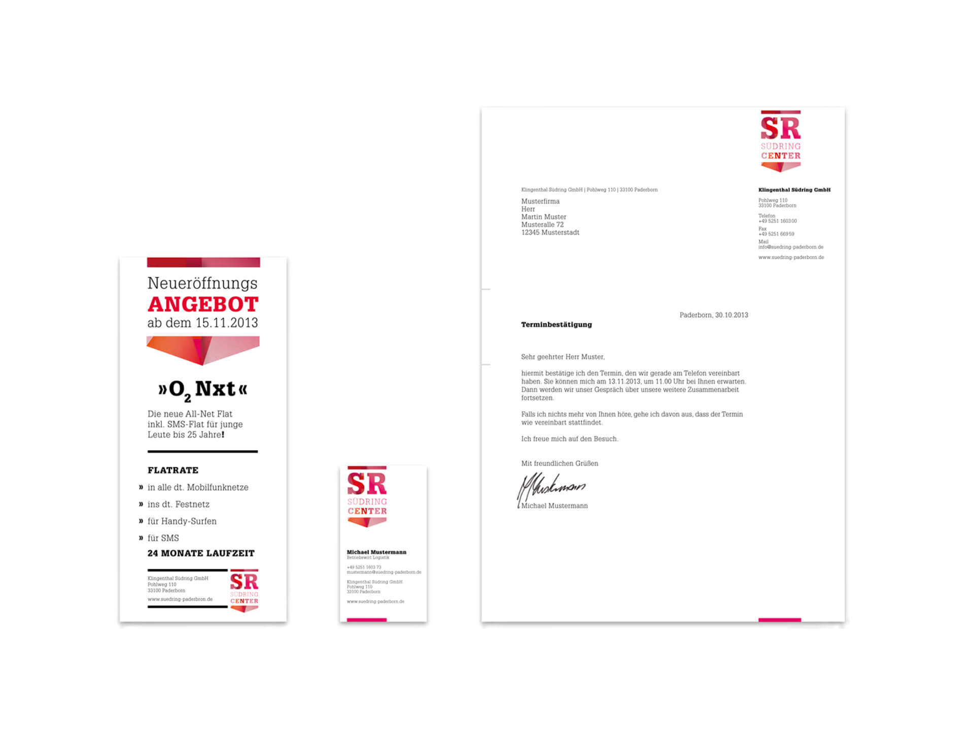
In the center of the logo: the initials of the Südring-Center "SR". Clearly structured by a line above and a dynamic, arrow-shaped basis elemtent - as a contemporary interpretation of the original company logo from 1969. Colour comes into play with red hues as highlight pattern that stands for the multifacetedness of the shopping world. So to say a second, emotional level that makes the emblem downright versatile. Depending on the campaign or occasion the pattern can vary, at times as diamond structure, at times as a collection of bars and lines. Still, the logo always stays true to itself. An exciting play of consistency and change, varying aesthetics and again and again new messages that customers can experience step-by-step as the completed conception gets realised.